
About Me
Hi! I'm Laura a graduate from IED Barcelona
"Visit España" came up with the idea of presenting the spanish society during the sixties and all the changes that the tourists brought to my country during those years.
My intention is to capture this concept with colorful textile prints and manipulations that show naked bodies, organic shapes and hidden words. The collection mixes traditional elements with modern ones such as printed technical fabrics that bring the 60s to the present day.
INSPIRATION
My idea for this collection was to show the many changes that took place in Spain during the 60s.
"Visit España" is a Fall / Winter Women's Collection of 4 looks that is inspired by the sun, the beaches, color, joy and “Grasia pa' vivir”. A research project on those years of uncovering, renovation, and opening. Fitted garments, shapes that follow the silhouette and that from time to time uncover that body that the postwar period had been in charge of covering. Bikini shapes that remind us of those Swedes who invaded our beaches and gave us a hitherto unknown freedom.
The colors, inspired by the summer, give the light and the joy that they tried to sell (and that ended up conquering our European neighbors) that was transmitted in those advertising posters that reflected that Spain of topics, of bullfighting, flamenco, the famously called "typical Spanish".
MY WORK
PORTFOLIOS
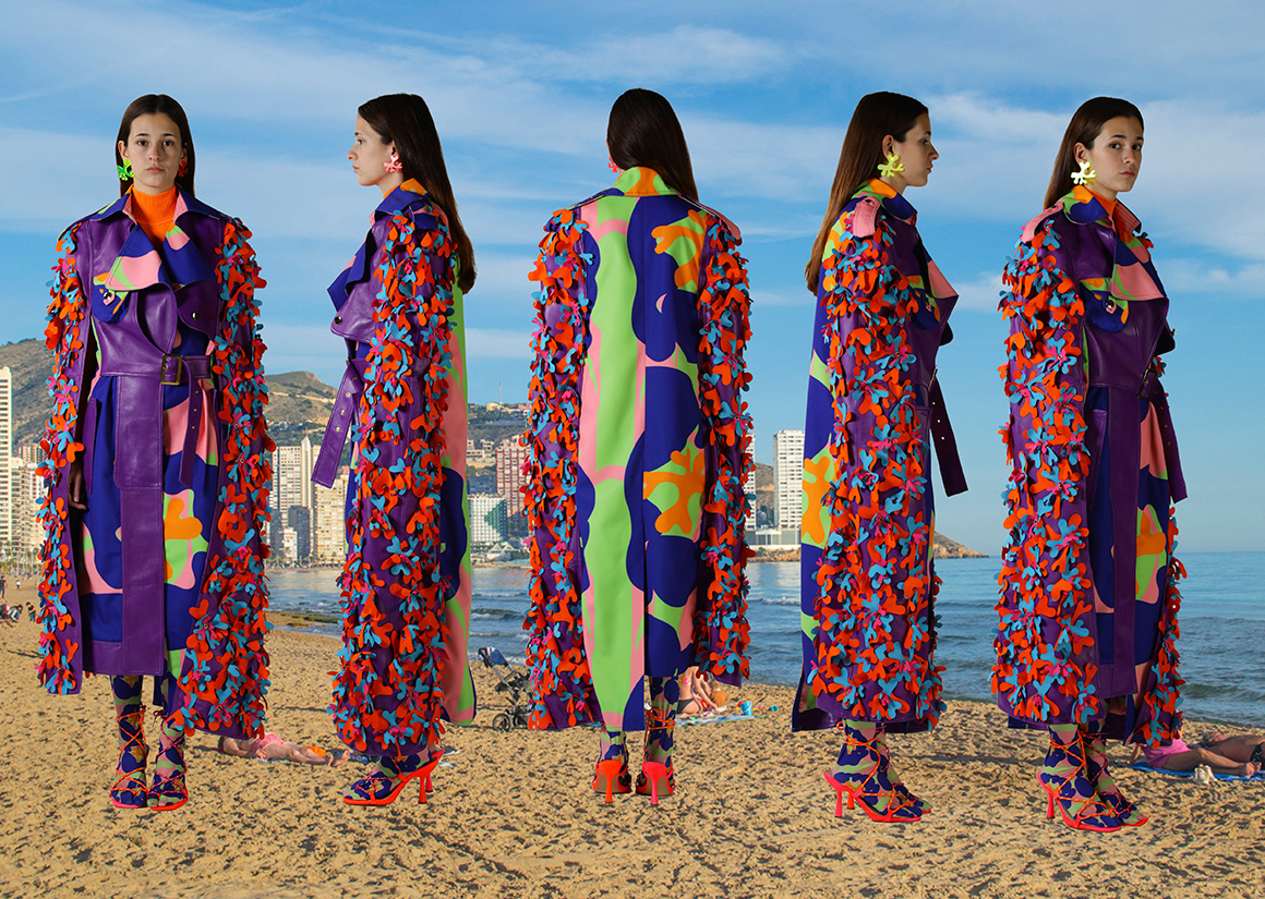
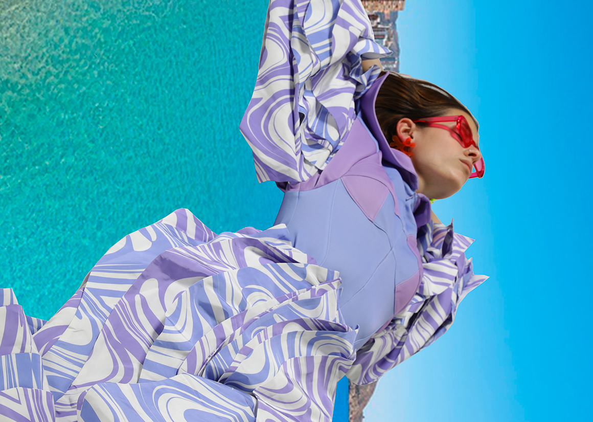
LOOK 1 TRENCH
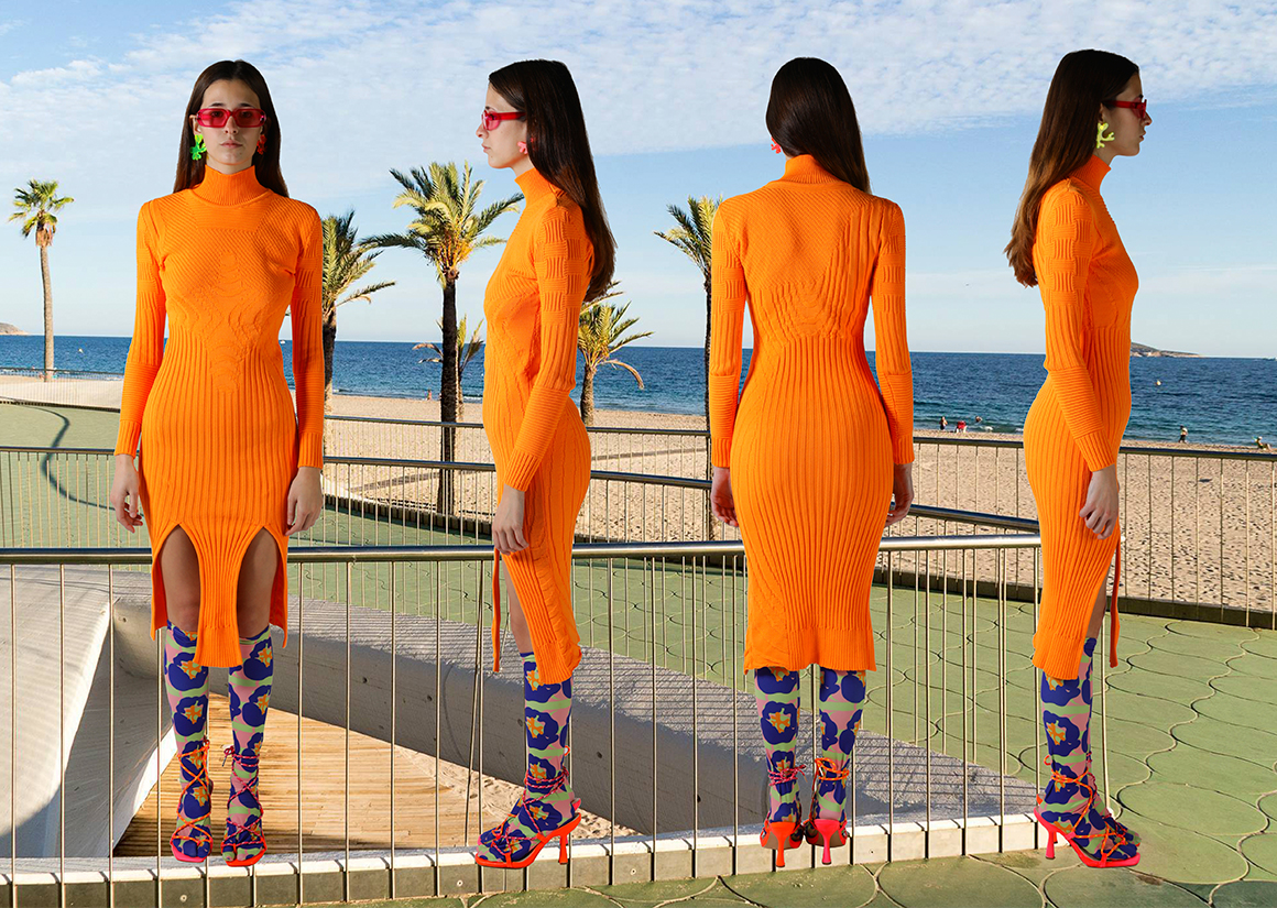
LOOK 1 DRESS
LOOK 1 DRESS
LOOK 1 TRENCH
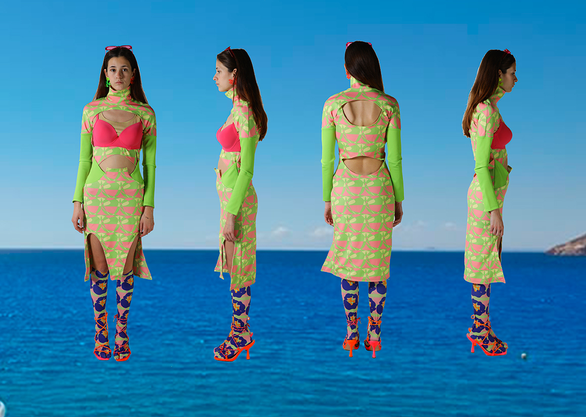
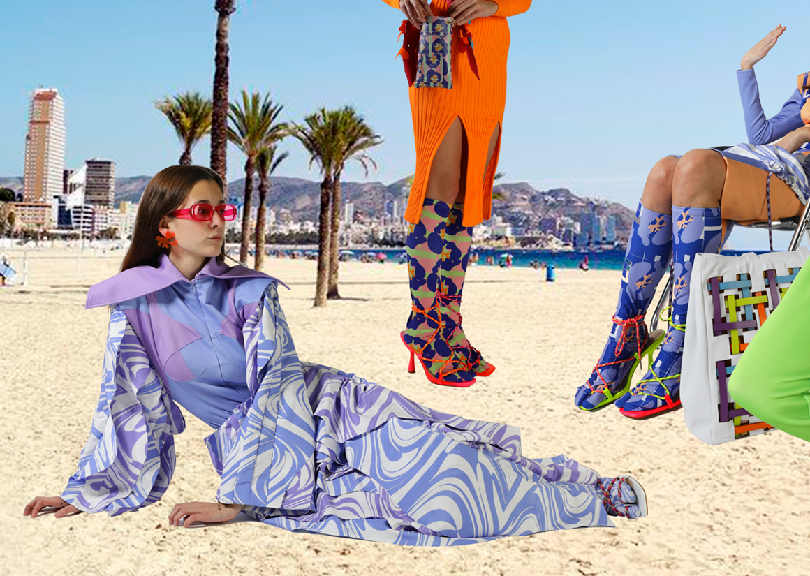
LOOK 2 DRESS
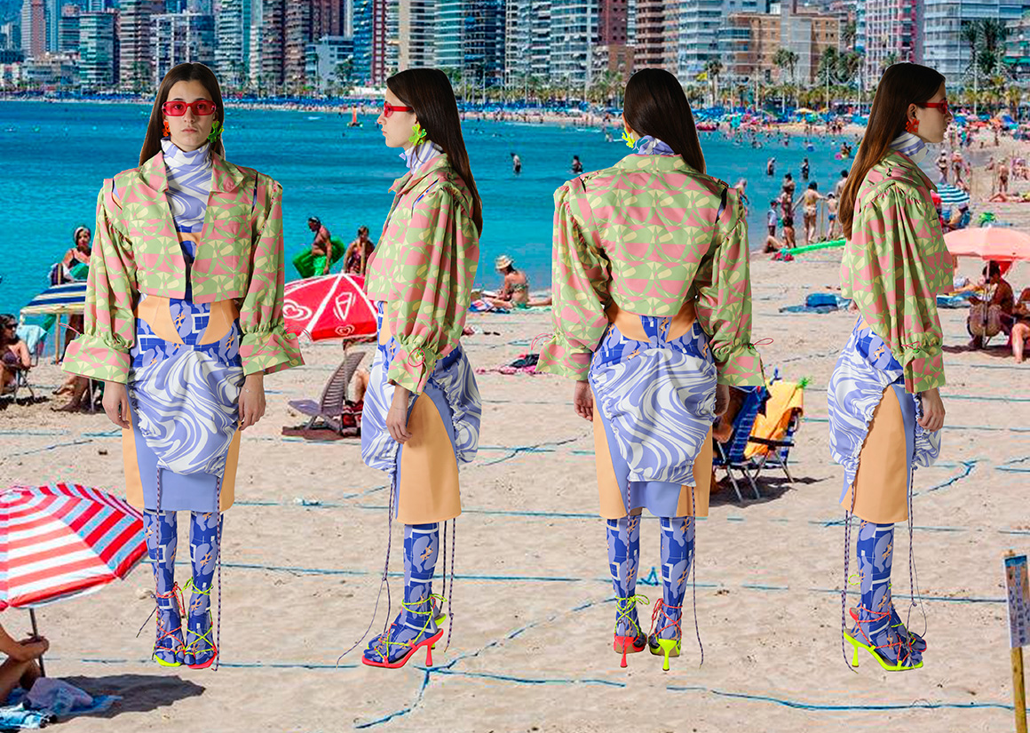
LOOK 2
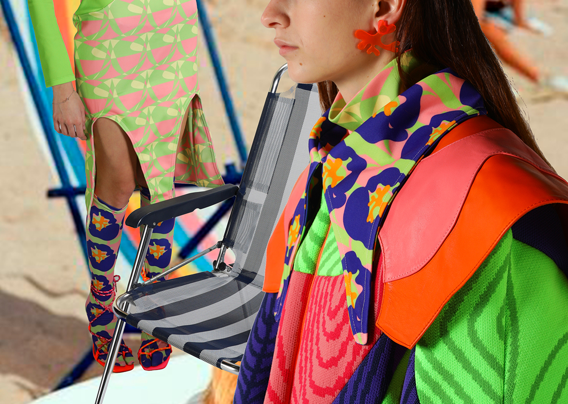
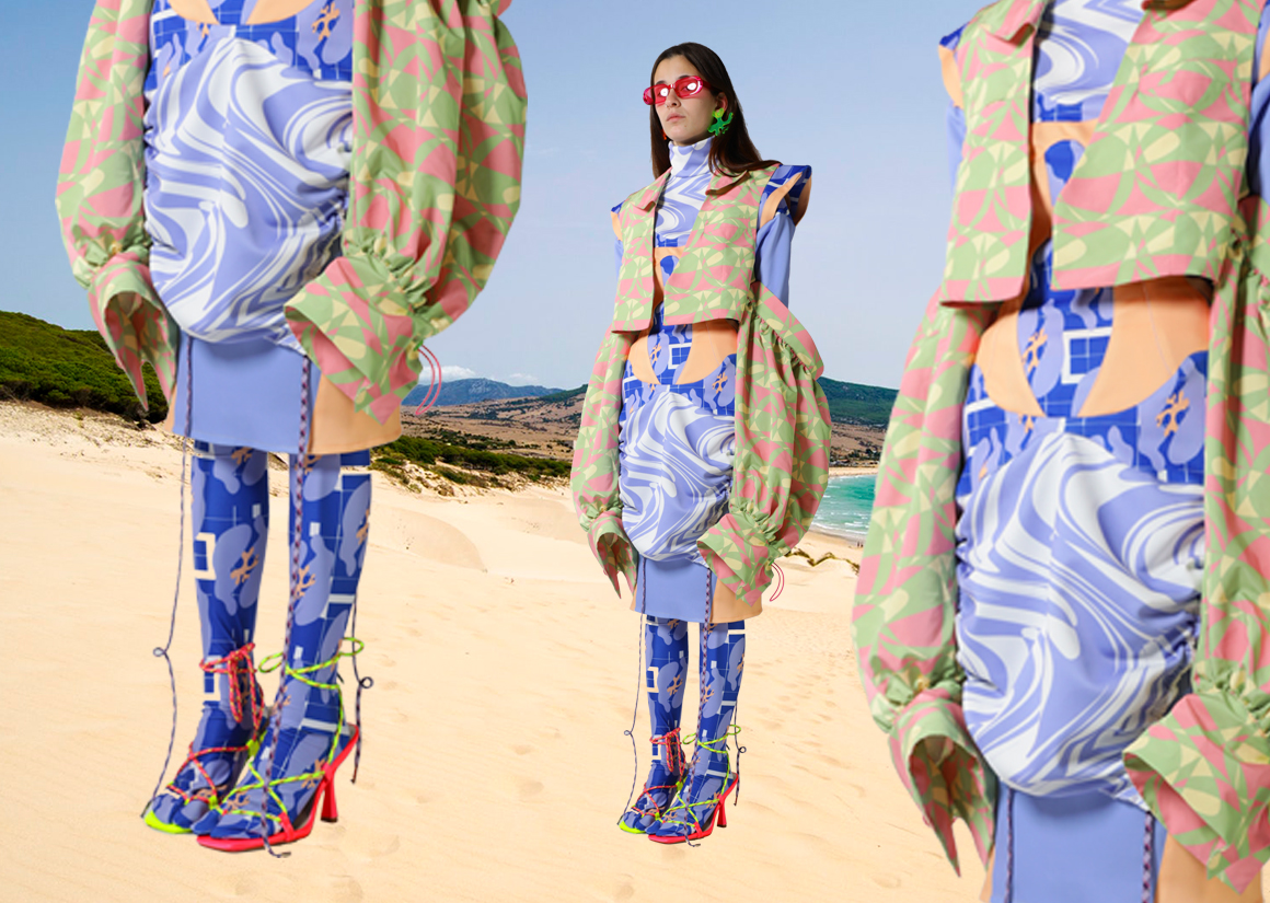
LOOK 3
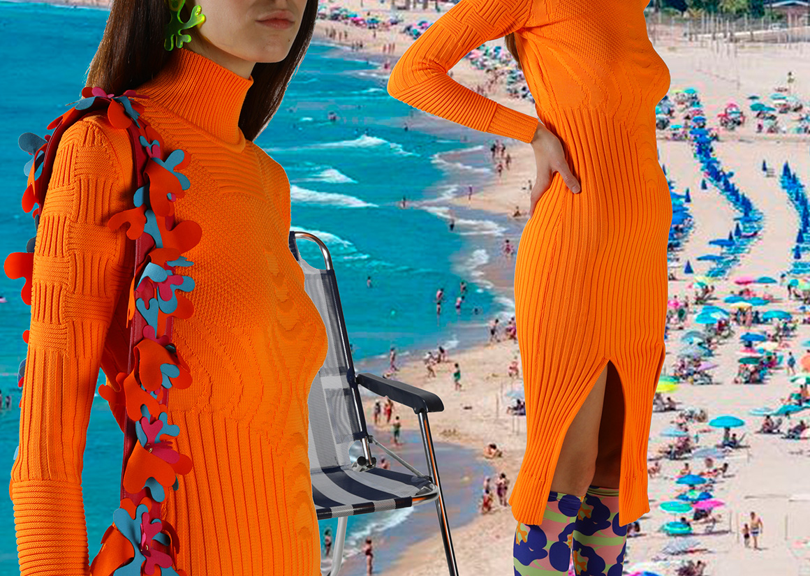
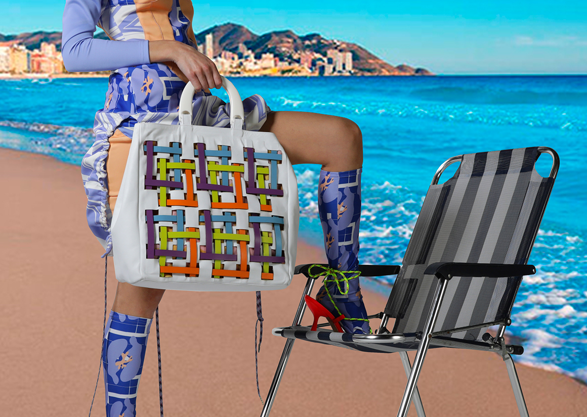
LOOK 3 DETAIL
LOOK 3 DETAIL
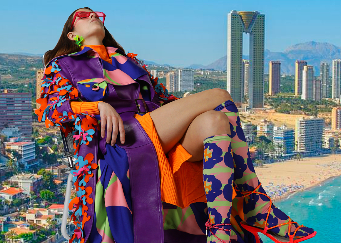
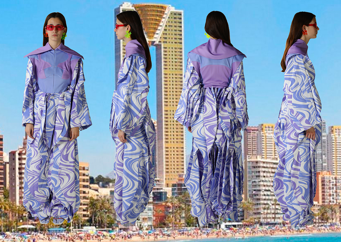
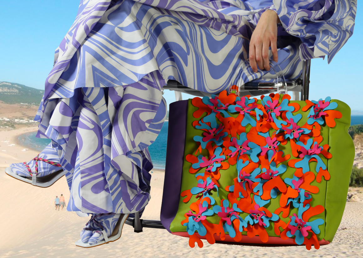
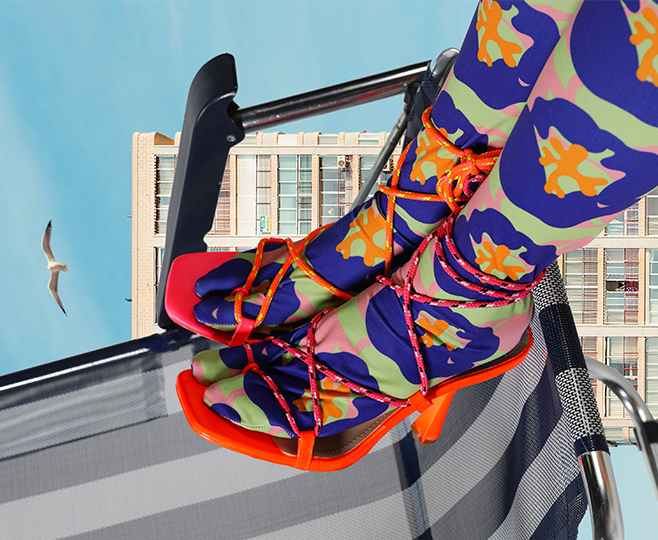
LOOK 4
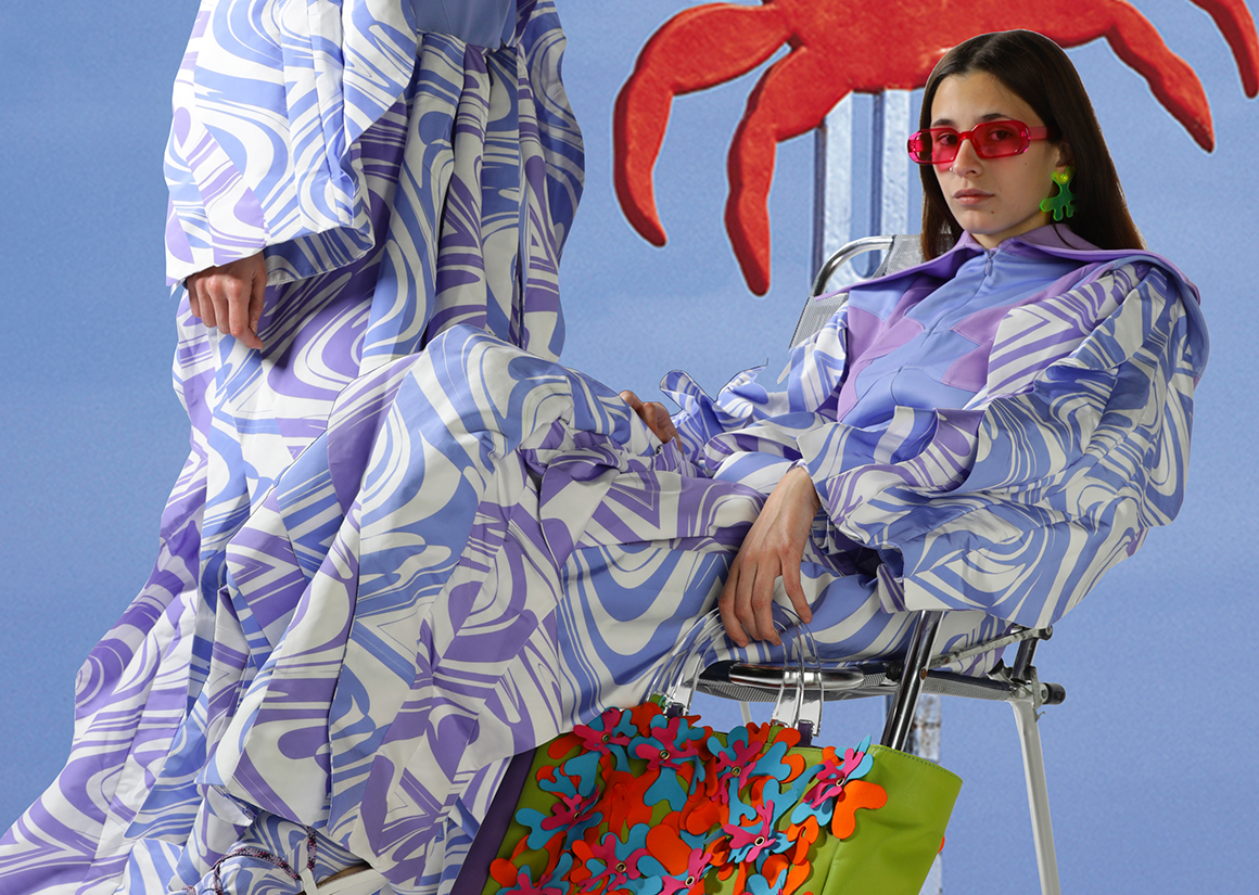
LOOK 4 DETAIL
PURSE DETAIL
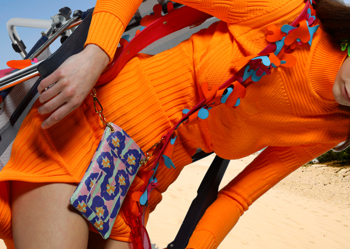
PURSE DETAIL
LOOK 4 DETAIL
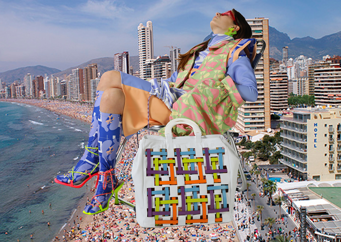
LOOK 4
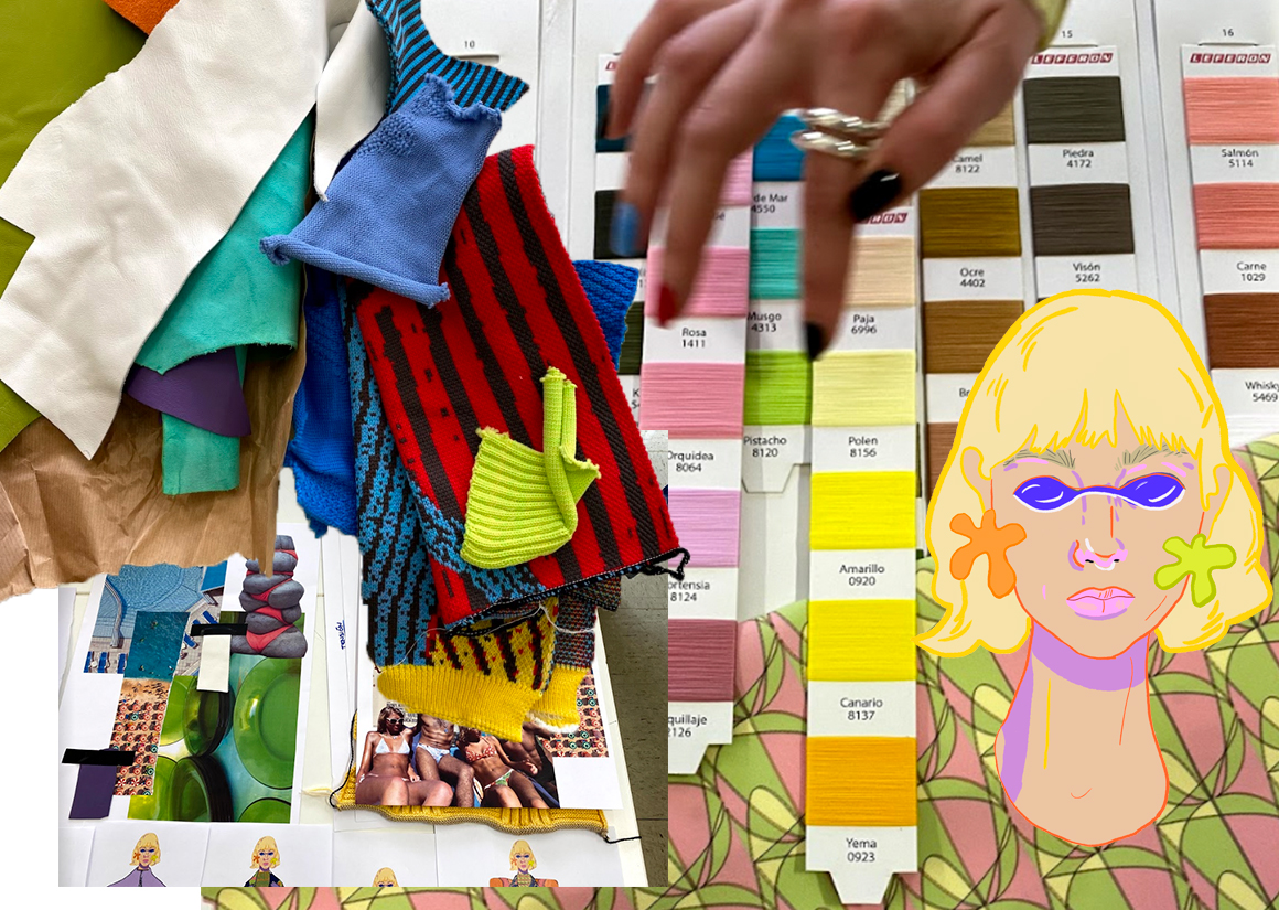
RESEARCH
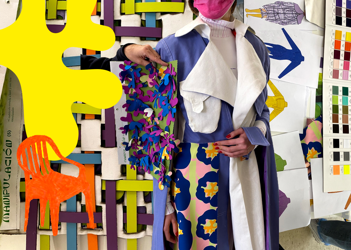
RESEARCH
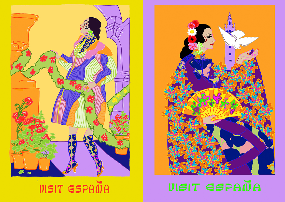
ILLUSTRATIONS
DETAIL
I wanted to show that clash between tradition and modernity, the old and the new.
The patterns also reflect that change that reached our shores and invaded the life of the Spanish, changing it completely. I reflect geometric elements of colorful tiles that filled the kitchens and bathrooms, organic shapes of the sea and the art of the moment, rectangular patterns that remind us of that new coastal building full of apartments and hotels ... And on the other hand there are the words, those that overlap them between they do end up forming patterns that remind us again of tiles, but that actually have a message between the lines. I also created what at first glance would be a floral print but if we look closely, we find naked bodies revolving around biomorphic shapes, all courtesy of Jean Arp.
“Let’s free the letters from their burden of being carriers of meaning " - Cecil Touchon


Graduate Fashion Week in partnership with:


