
About Me
Hi, I'm Hermione, a fashion photography graduate from LAU.
Hermione creates a fashion-facing story of mental strength and resilience, as well as on the flip side, unfolding feelings of emptiness and displacement as the nation struggles with the impacts of the pandemic on mental wellbeing.
This project endeavors to transform the past year of uncertainty and unrest into a fresh body of work that draws on elements and emotions endured, both high and low. It seeks to explore the triumphs and struggles, as well as celebrating important, innovative progress made in the fashion industry to widen the scope of image-making.
INSPIRATION
I wanted to unpick certain emotions and explore how to portray them visually, in a fashion context.
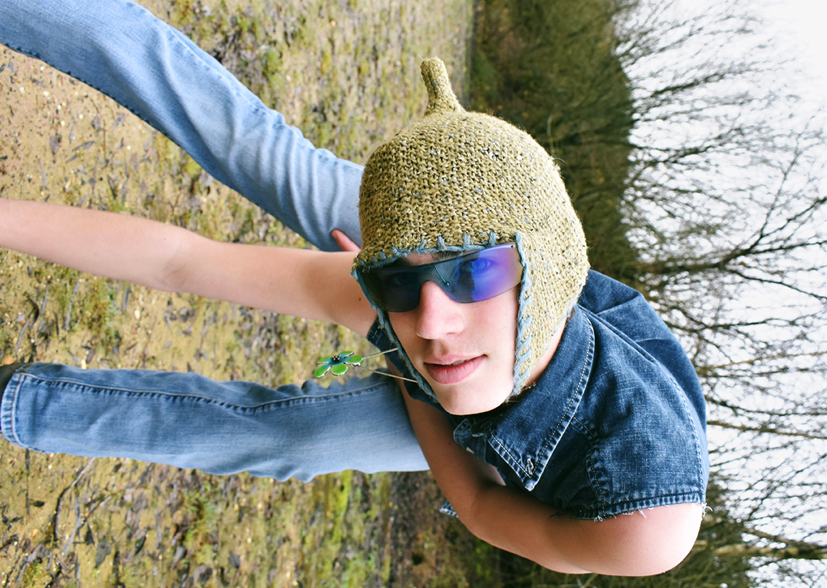
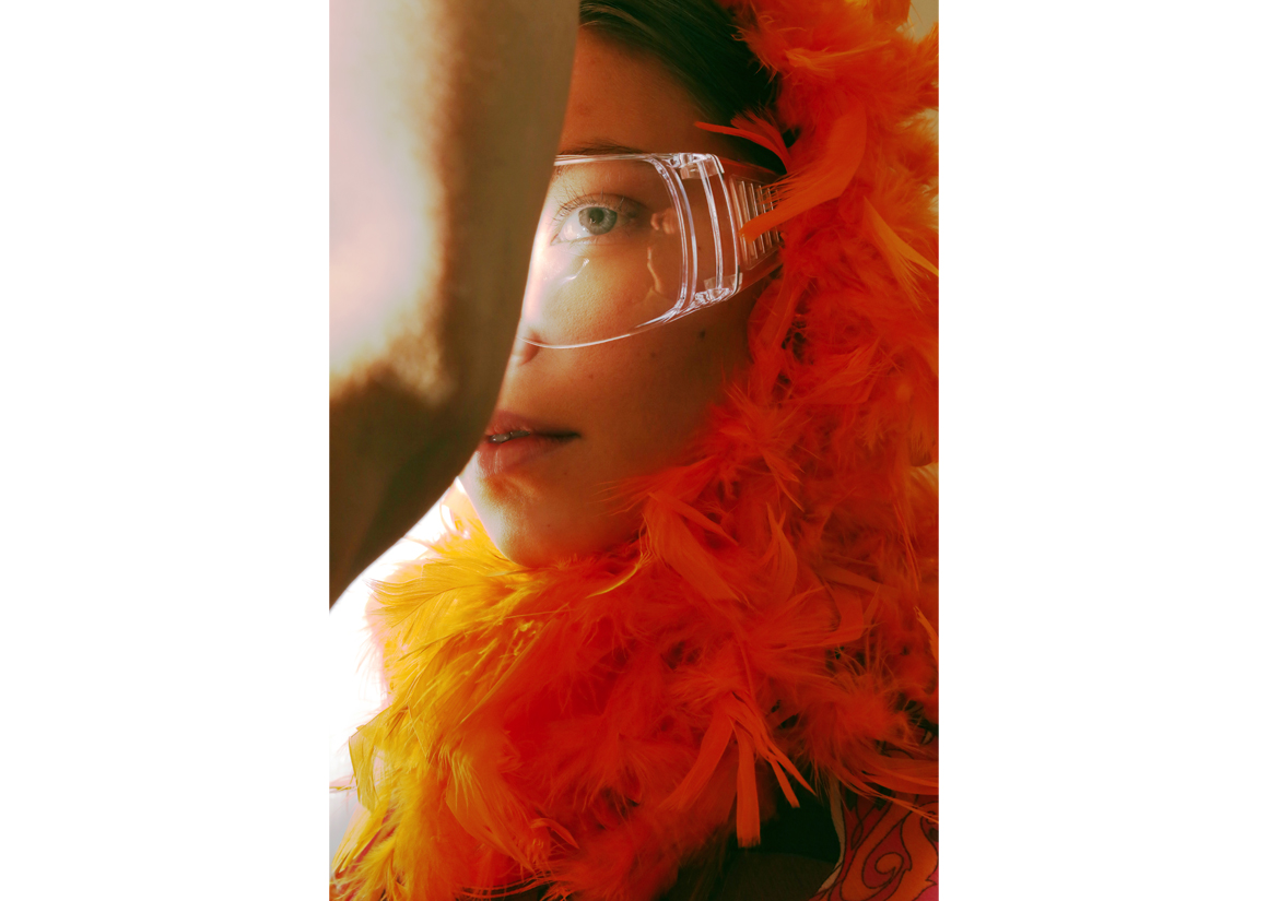
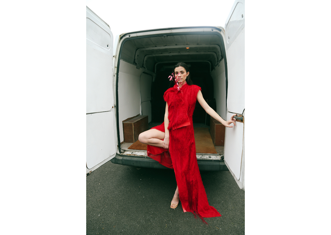
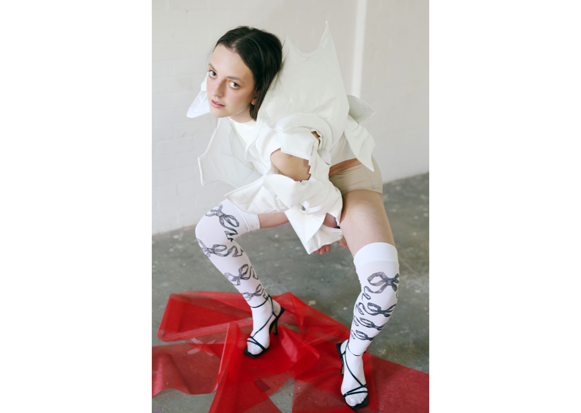
Inspired by the chaos of the pandemic, venturing into uncharted territory and the abundance of emotions that came with it, I wanted to create a body of work that explored mental wellbeing visually through those of colour and perspective. Partly influenced by personal experiences and of those of my loved ones, I explore specific themes of longing, weightlessness, boredom, and self-expression. These themes all stem from unpicking a sense of emptiness that the pandemic and lockdown brought upon a lot of us.
Taking these themes and using vibrant pops of colour and peculiar perspectives - something that I have been drawn to across my wider portfolio - I am able to turn influences of emotions and unrest into fashion imagery that carries a thought-provoking weight. On the flip side, the project was also inspired by the triumphs we have endured; learning to adapt both in day-to-day life and in the world of fashion, with exciting, innovative ways of working emerging, which I explored through remote shooting.
MY WORK
PORTFOLIOS
Grandma's Hat
Let Me In Please
Red Stream
Broken Phone - remotely photographed
FLASH
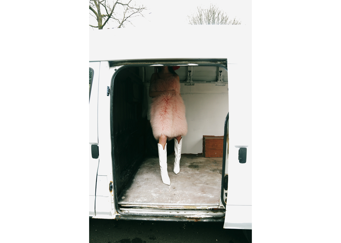
Get In The Van
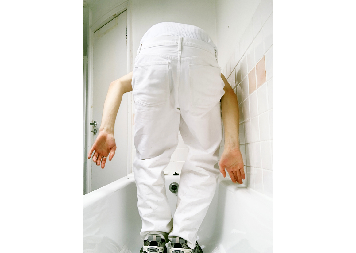
Bath Time - remotely photographed
Puddle
Kick Back
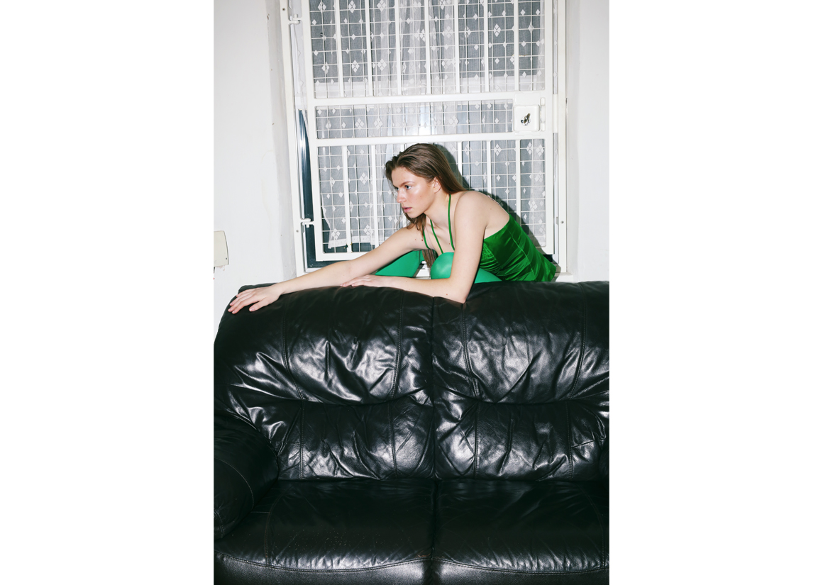
Can't See
See Ya
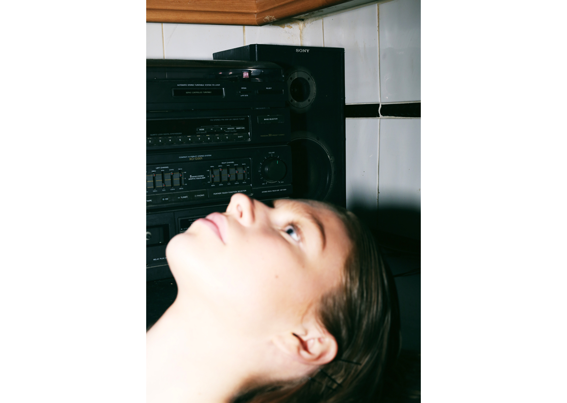
Too Loud
Peekaboo
Don't Fall In
RED
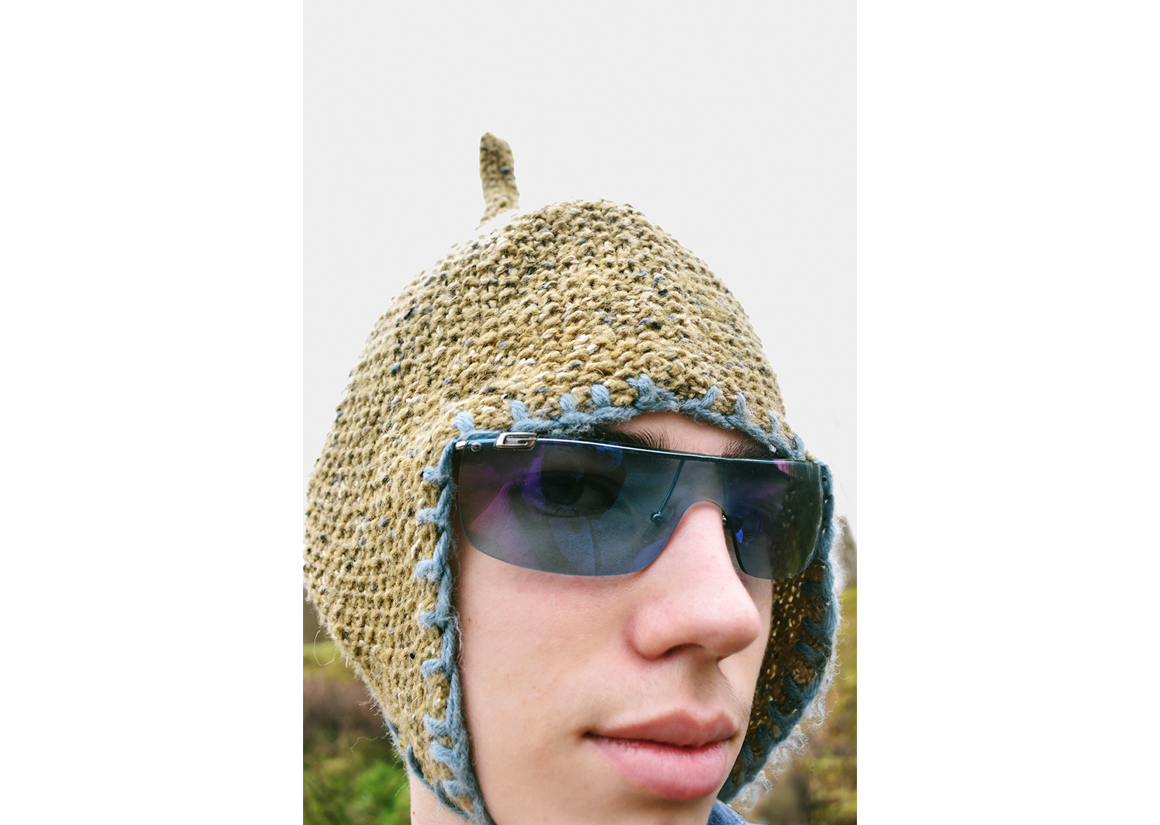
Serious Hat
Afloat
Space
On The Look Out
DETAIL
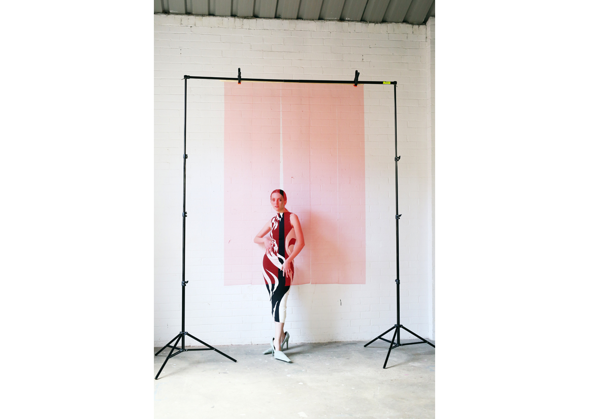
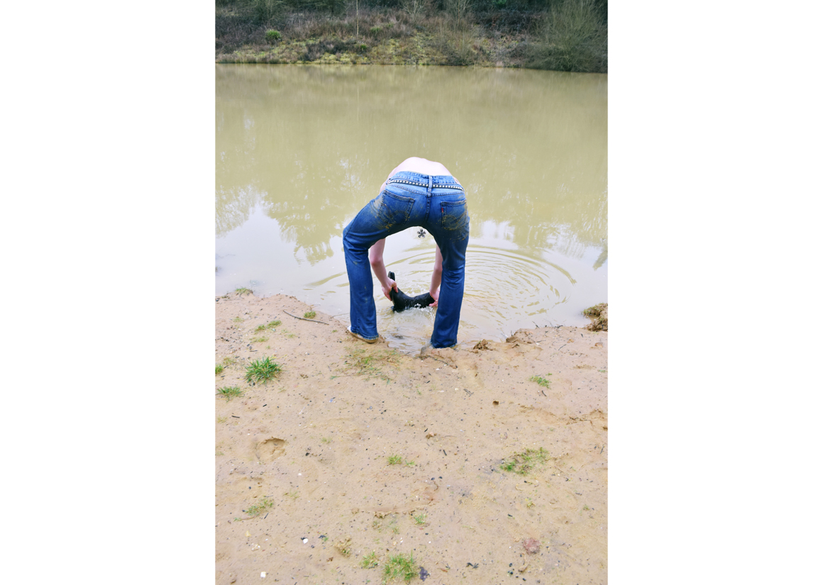
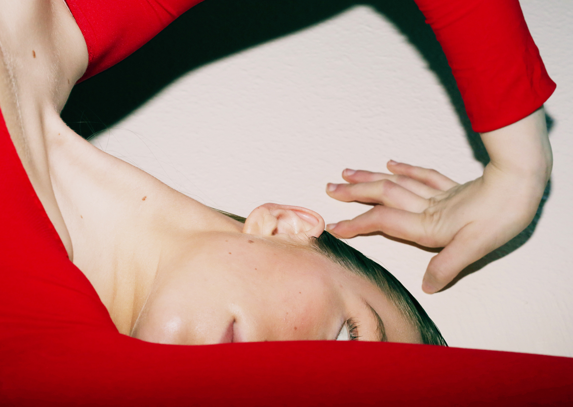
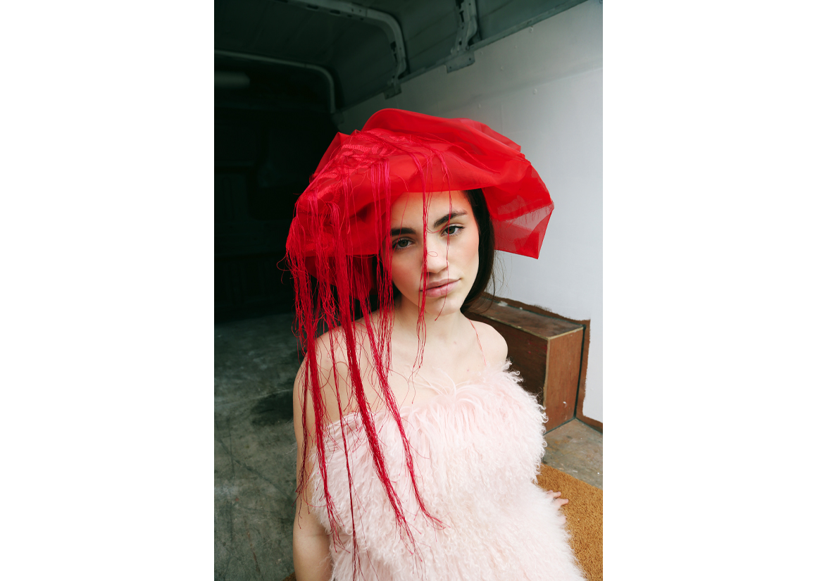
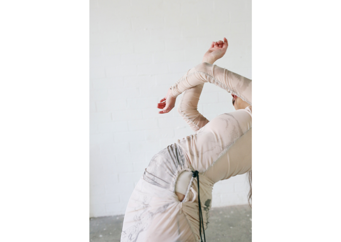
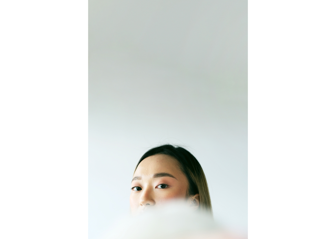
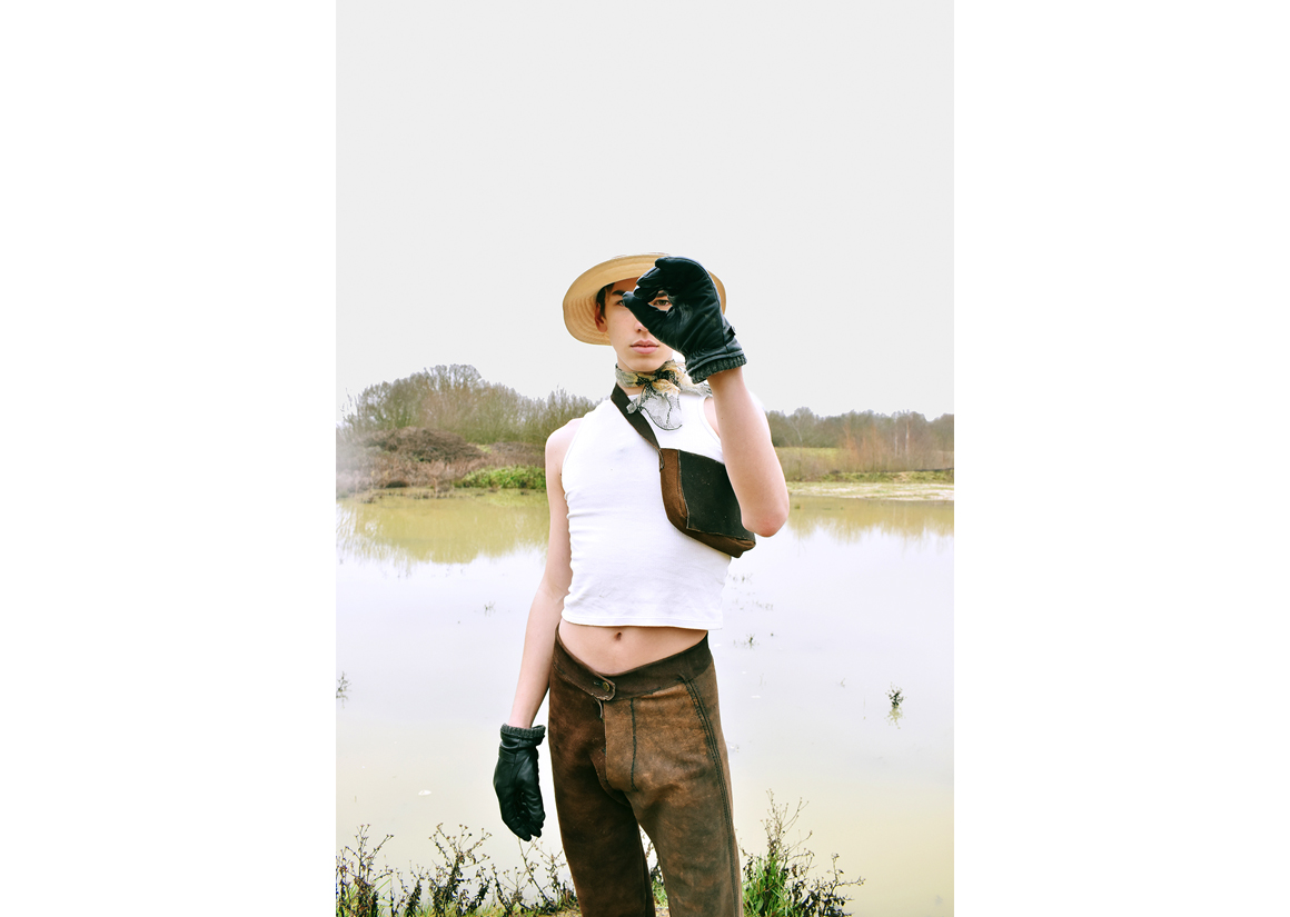
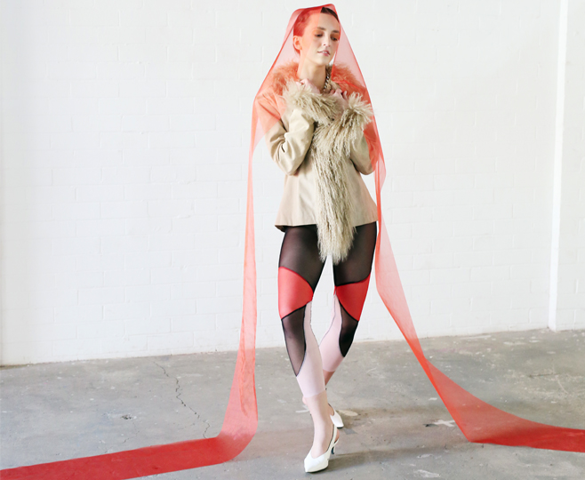
I used colour and perspective to portray emotions in a fashion context.
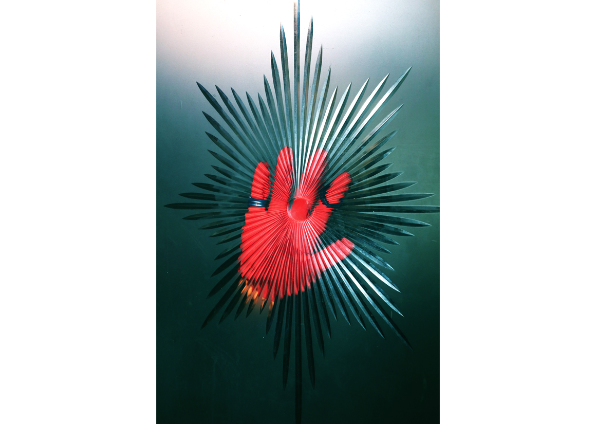
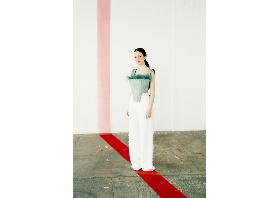
The colour red plays a key part of the story telling throughout. The attraction to this colour from the outset derives from its connotations of health, strength, intensity and its ability to provoke a physical and emotional response in its viewer. The sporadic use of this colour helps to tie the wider body of work together, as the images come from a variety of different photoshoots and micro-concepts. I have found myself excited and captured by this colour in all aspects of life, and therefore in this context, it anchors the connection between personal experience and creative output. The use of peculiar perspective and crop in some areas of the work creates the feeling of close interaction between those in-front and behind the lens, contributing to a personal, intimate feel which is appropriate when exploring intricate emotion.
Imagery that dissects intricate, thought-provoking concepts using colour, perspective and pose to generate fashion-facing visuals.


Graduate Fashion Week in partnership with:


