
About Me
Hi, I’m Dylan a graduate from Northumbria University FDM
Queer expression over the years in media has been altered or all together silenced, however, it is time for a diversity revolution. It’s due for the creation of a brand that uses graphics to build an inclusive and representative environment for the ‘outsider’.
I feel it’s time to bring identity exploration out of the underground and into the mainstream. Avant-garde and maximalism style fashions have been the traditional way of making a statement, but I feel the buzzing nature of streetwear can provide the market a fresh take on bold and innovative. Accessibility and education to subcultures is key.
INSPIRATION
My initial idea began from my experience in the buzz of a nightclub.
The rhapsody of a ‘night-out’ can sometimes be simplified and almost be made to seem juvenile, however, it was working in nightlife and seeing first hand the euphoric and over-worldly qualities it exudes. In no other environment is inhibition and pretence lost in such a childlike way. In contrast, however, in no other setting is people’s darker desires realised. I wanted to explore this underground dissonance and the way a rave can feel like a wonderland for many people, mainly queer people.
Diversity and representation quickly became another inspiration for this collection. Queer nightlife for many is the first and only time they get to see others like them, I wanted to channel this exhilaration of feeling seen in my project. Inclusiveness in fashion is a theme that is currently been brought up in media with many brands offering gender queer collections and the use of trans and non-binary models in publications and runway. I wanted to create a concept that is unapologetically bold.
MY WORK
PORTFOLIOS
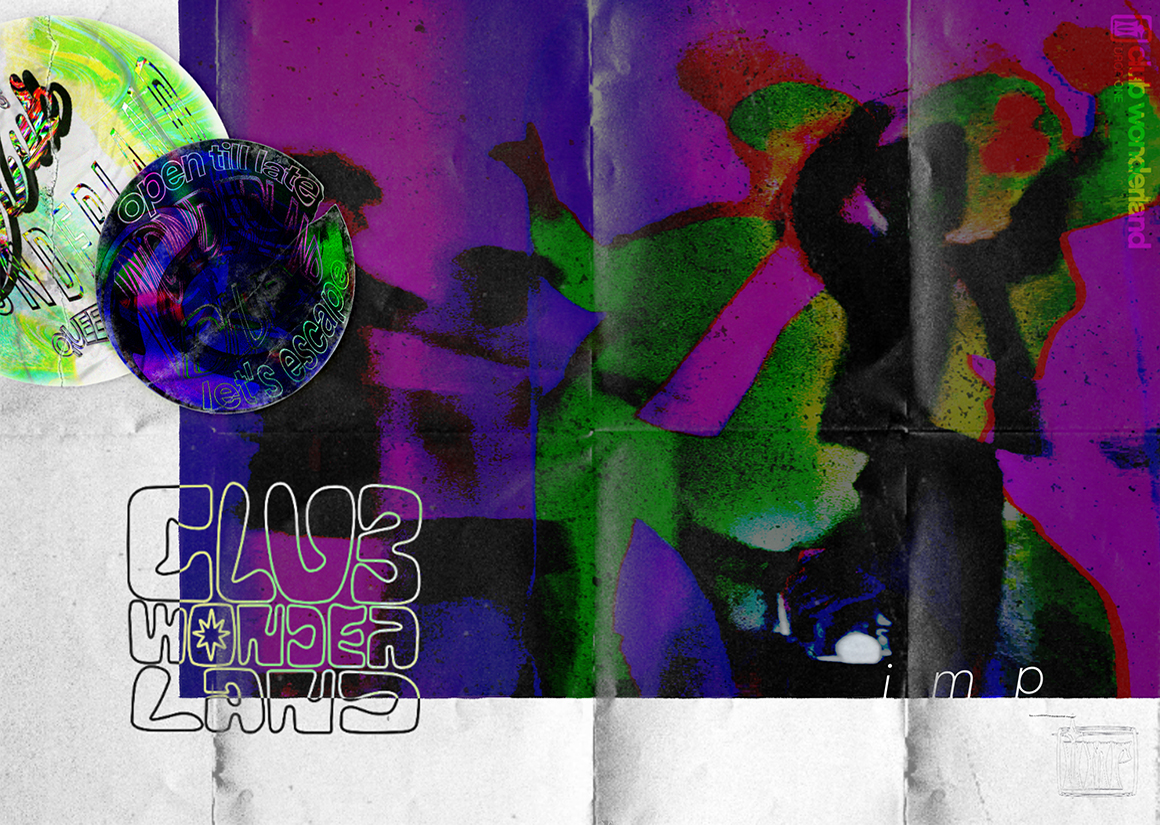
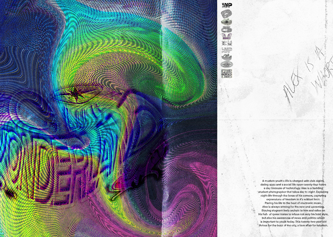
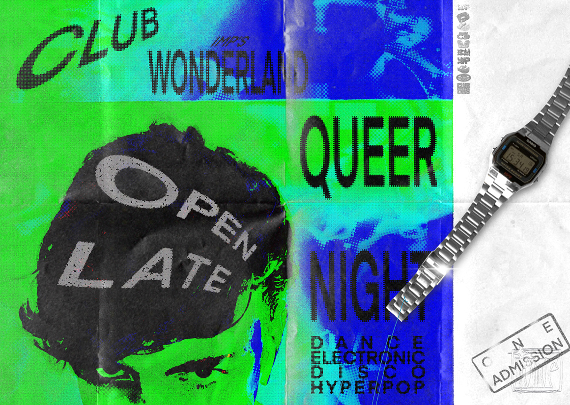
CLUBWONDERLAND - cover
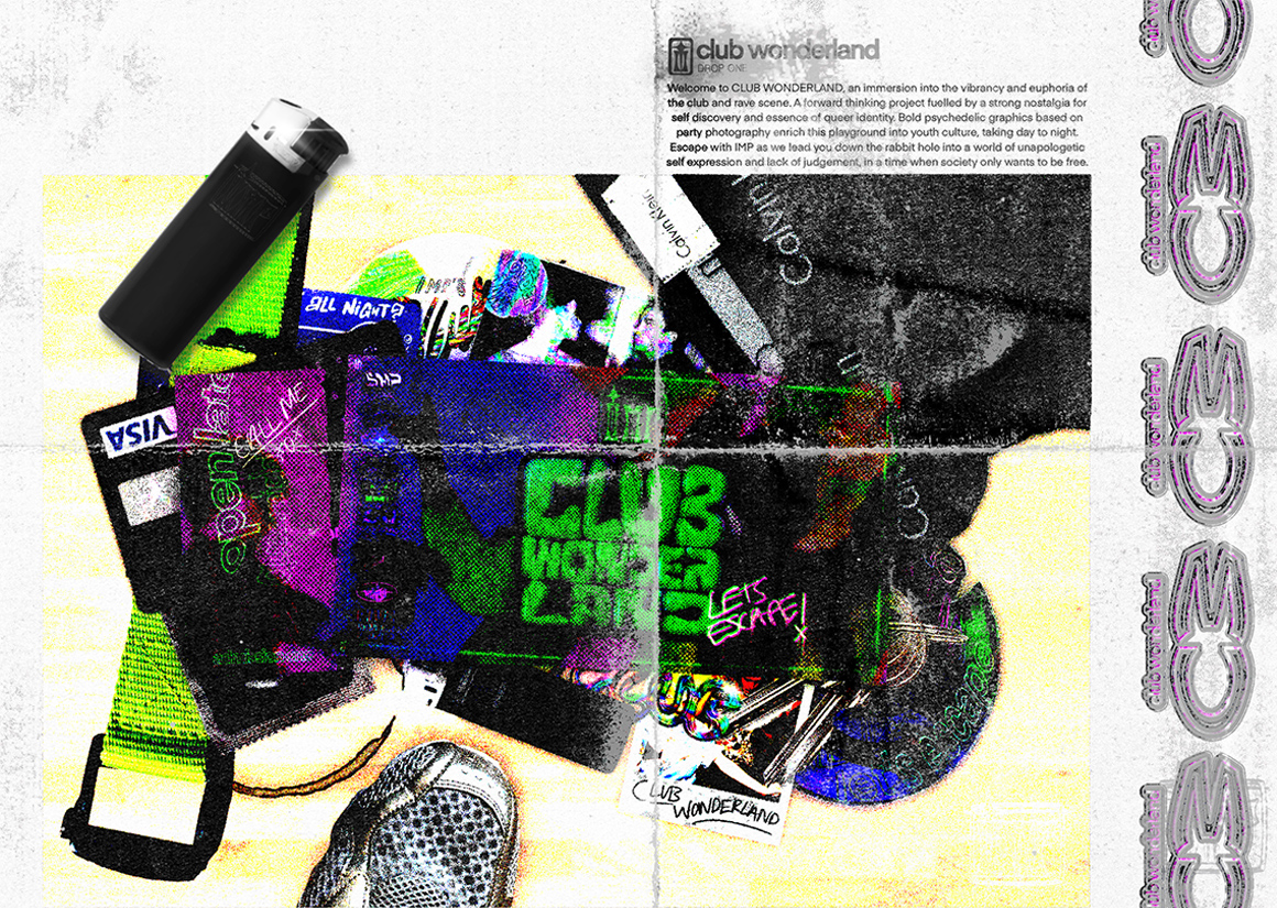
CLUBWONDERLAND - synopsis
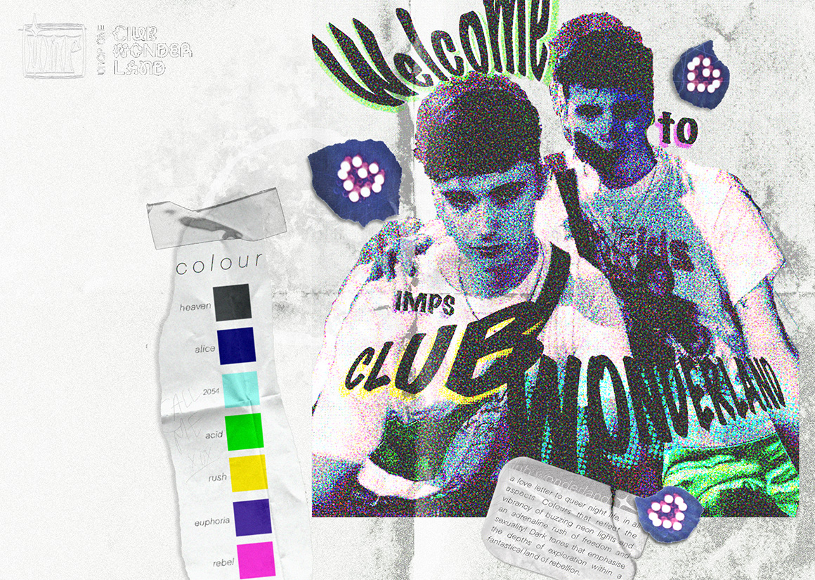
CLUBWONDERLAND - colour
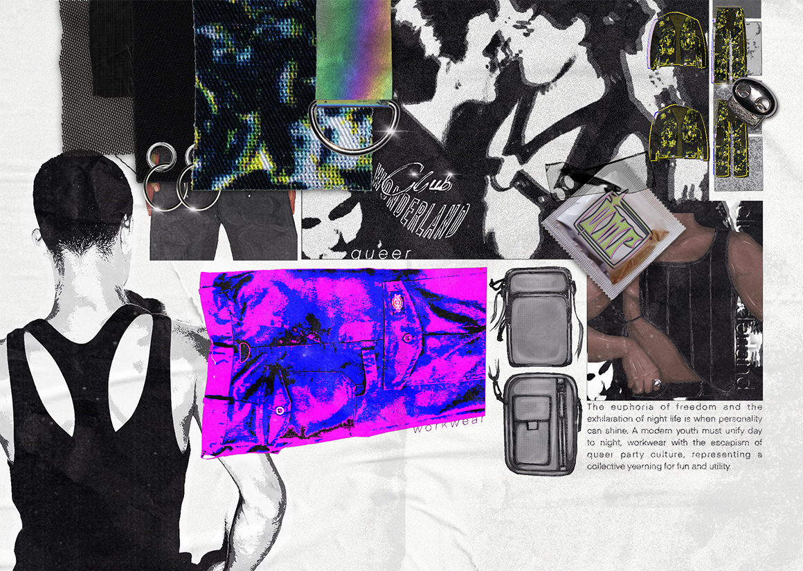
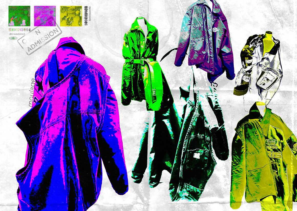
CLUBWONDERLAND - fabric
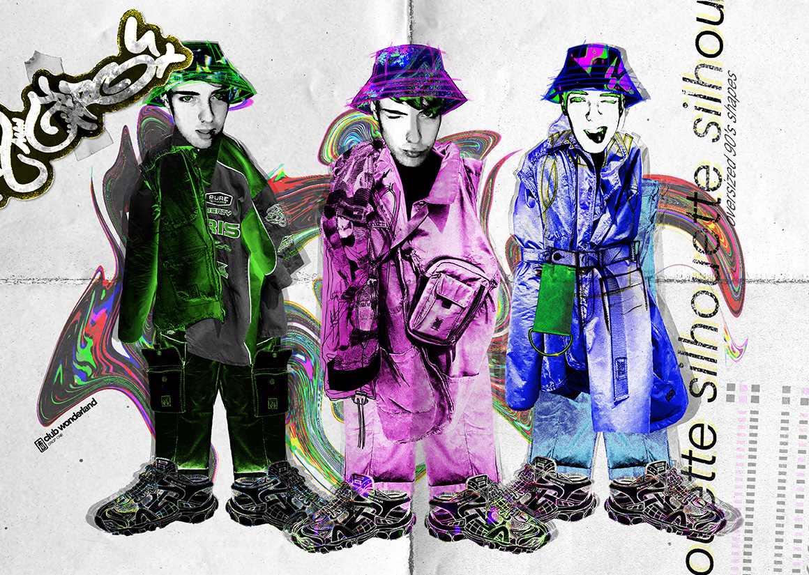
CLUBWONDERLAND - silhouette
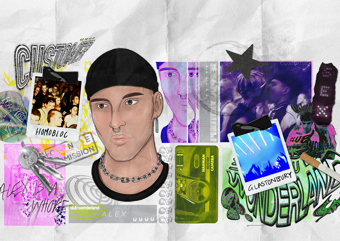
CLUBWONDERLAND - customer
CLUBWONDERLAND - customer description
CLUBWONDERLAND - moulage
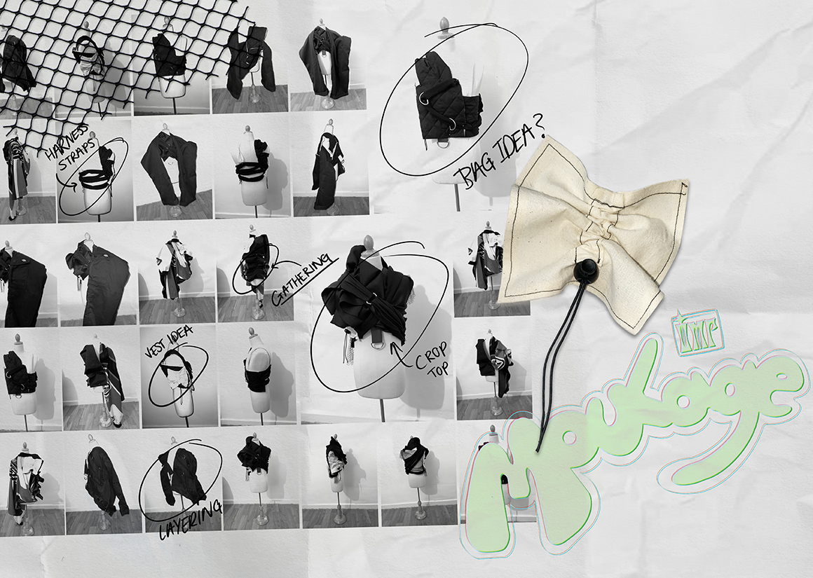
CLUBWONDERLAND - moulage
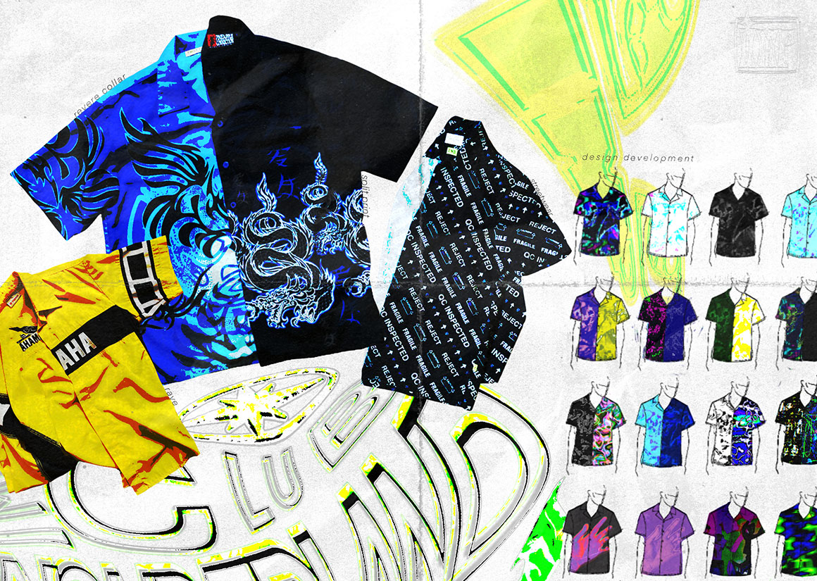
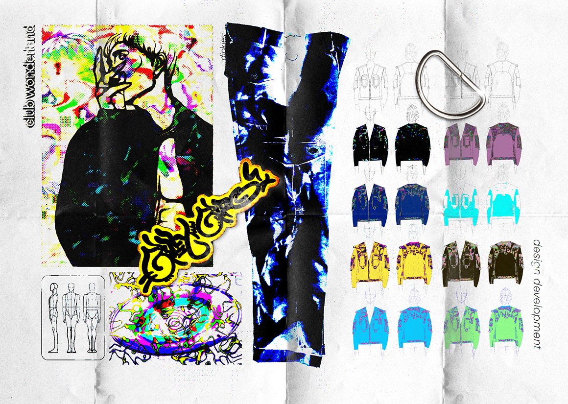
CLUBWONDERLAND - shirt exploration
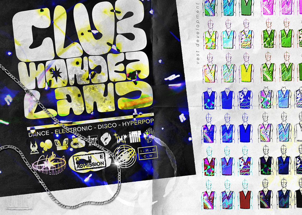
CLUBWONDERLAND - vest development
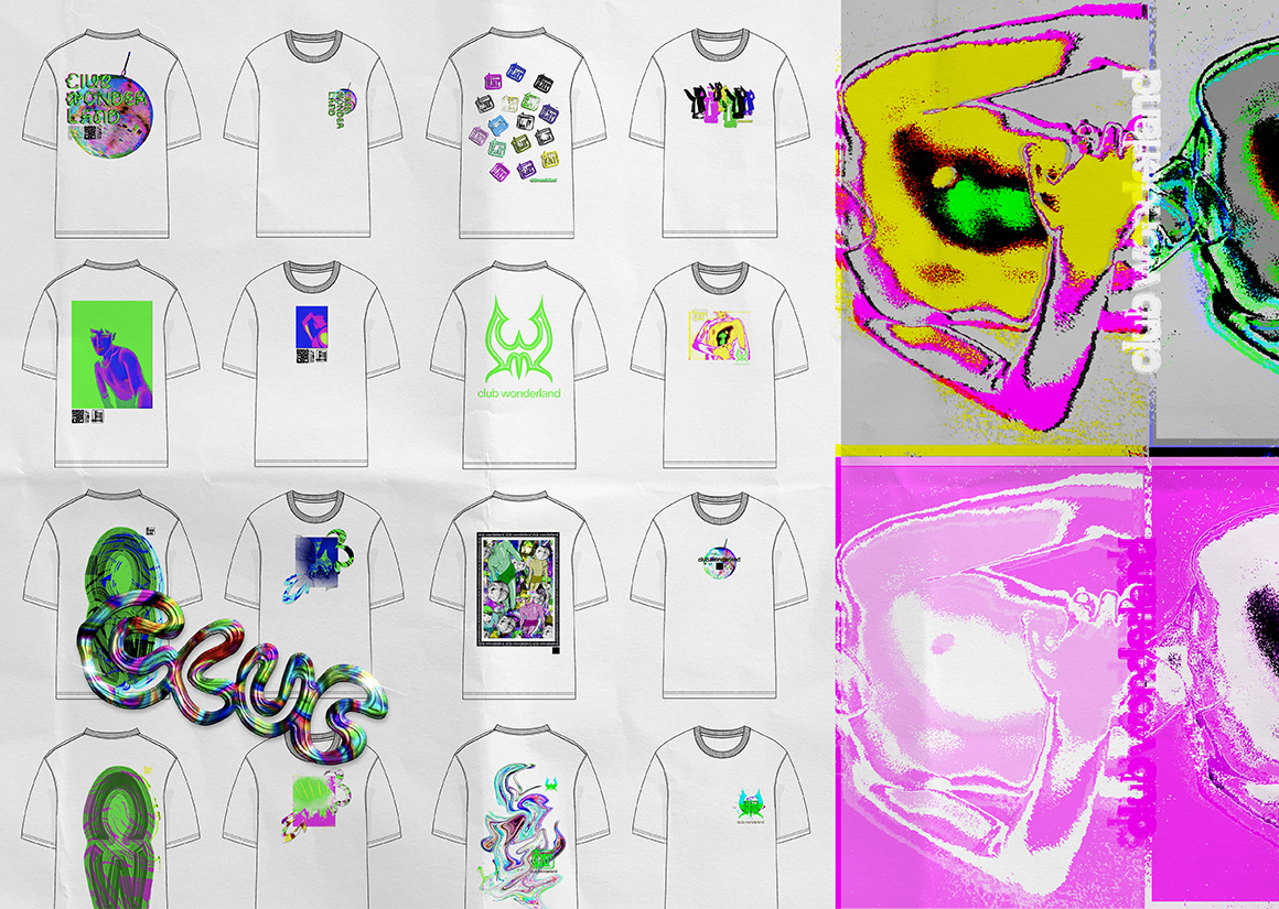
CLUBWONDERLAND - t-shirt graphics
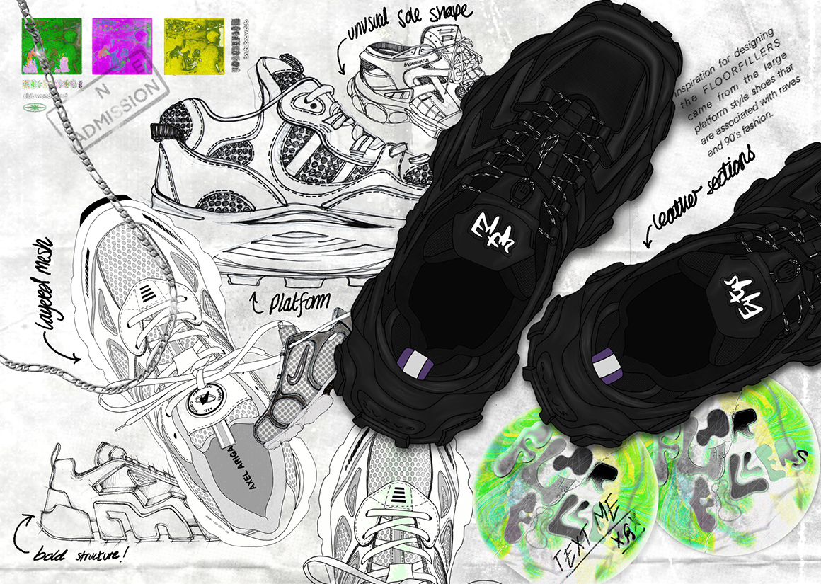
CLUBWONDERLAND - trainer exploration
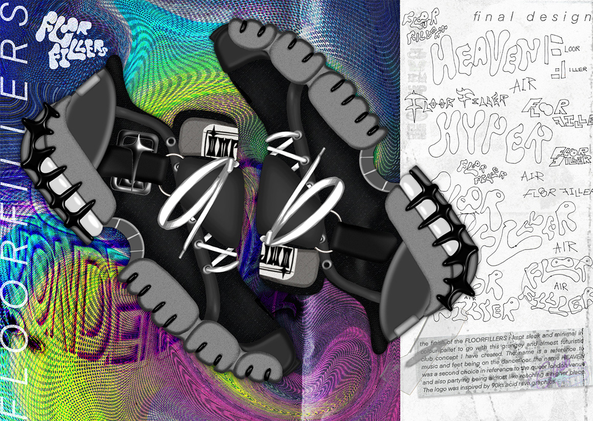
CLUBWONDERLAND - trainer design
CLUBWONDERLAND - development
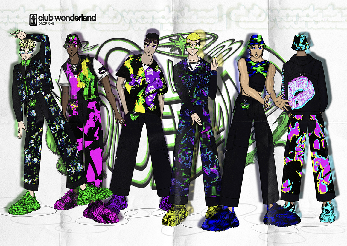
CLUBWONDERLAND - line-up
CLUBWONDERLAND - graphic
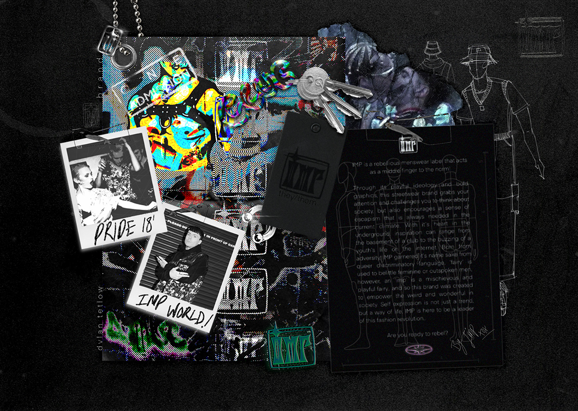
IMP - brand
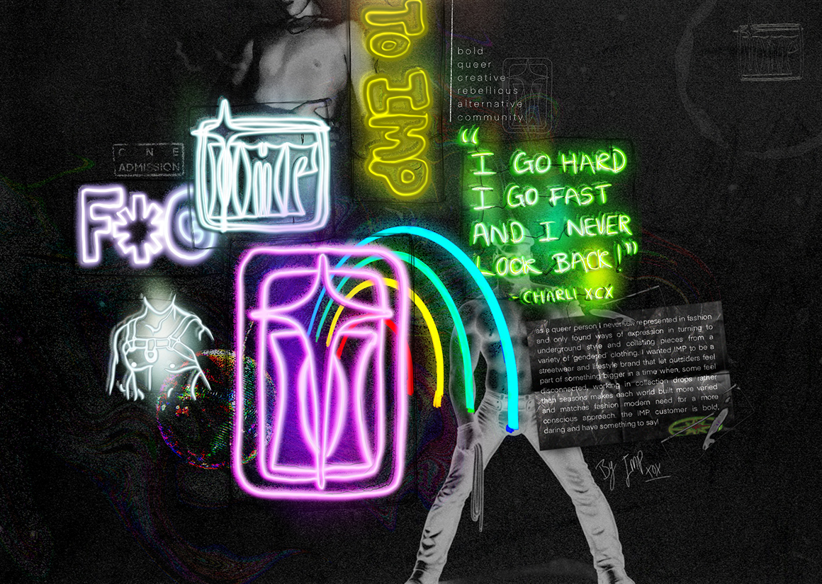
IMP - brand
DETAIL
This is my ode to the gay community that I hold dear
This project is full of gay symbols that I have taken from my own knowledge and further research. An example of these references include the placement of hardware on my garments fixed to the right side to acknowledge the way wearing an earring on the right lobe for men is a calling card for their sexuality. I also referenced the leather queer community with the harness shape seam lines and chap style trouser design.
“It is so important for queer people, and for anyone making [art] that’s deemed to be somehow alternative, they shouldn’t be made to feel like their identities are not mainstream” - SOPHIE


Graduate Fashion Week in partnership with:


