
About Me
I’m Beth a Fashion Design Graduate from Sheffield Hallam University.
Beth Lomas is a womenswear designer whose work pairs traditional silhouettes with punchy colours and prints capturing a strong sense of femininity within her work.
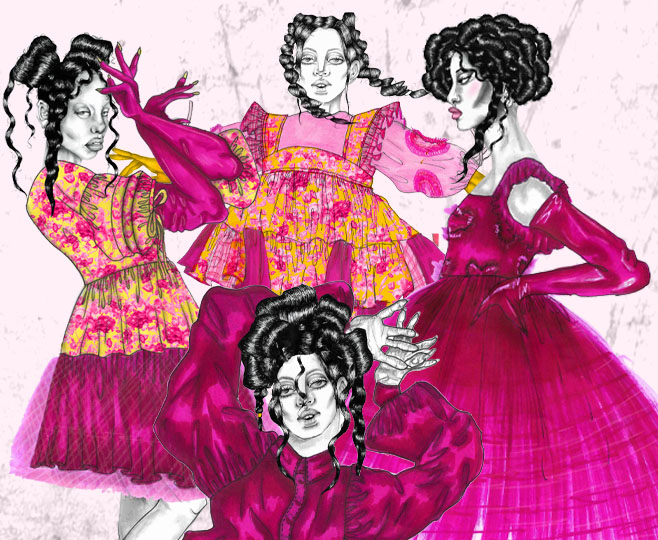
Throughout my degree I have built up an interest in designing prints I find this medium adds impact to my design work and helps me emulate my concepts narratives. I love to play with colours, creating clear contrasts within to create an interaction of hues that give my garments depth and intensity. I have a passion for illustration and have developed a distinct Illustrative style. I love to experiment with how I can exaggerate my illustrations further showing the viewer how I envision my designs on paper, I do this by having fun with drawing my muses and placing them in different poses.
INSPIRATION
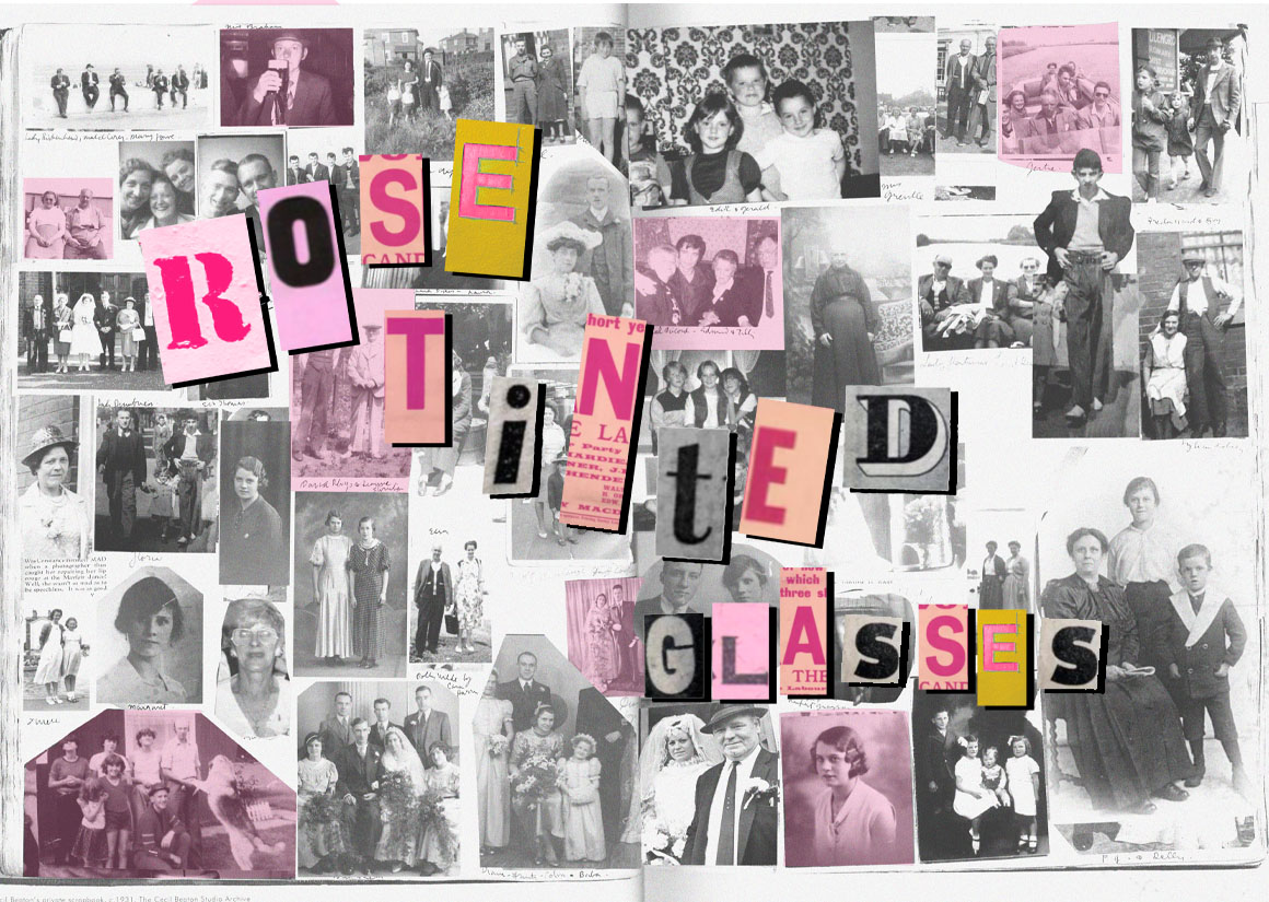
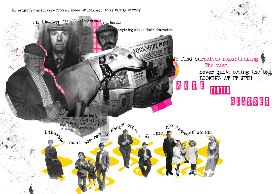
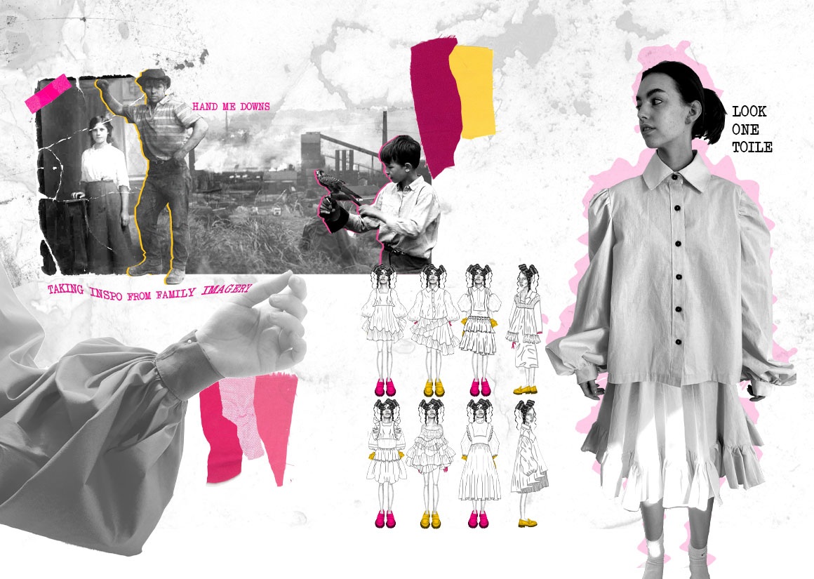
The holiday may be spoilt by rain, but it will be the sunny days that make it to the family album.
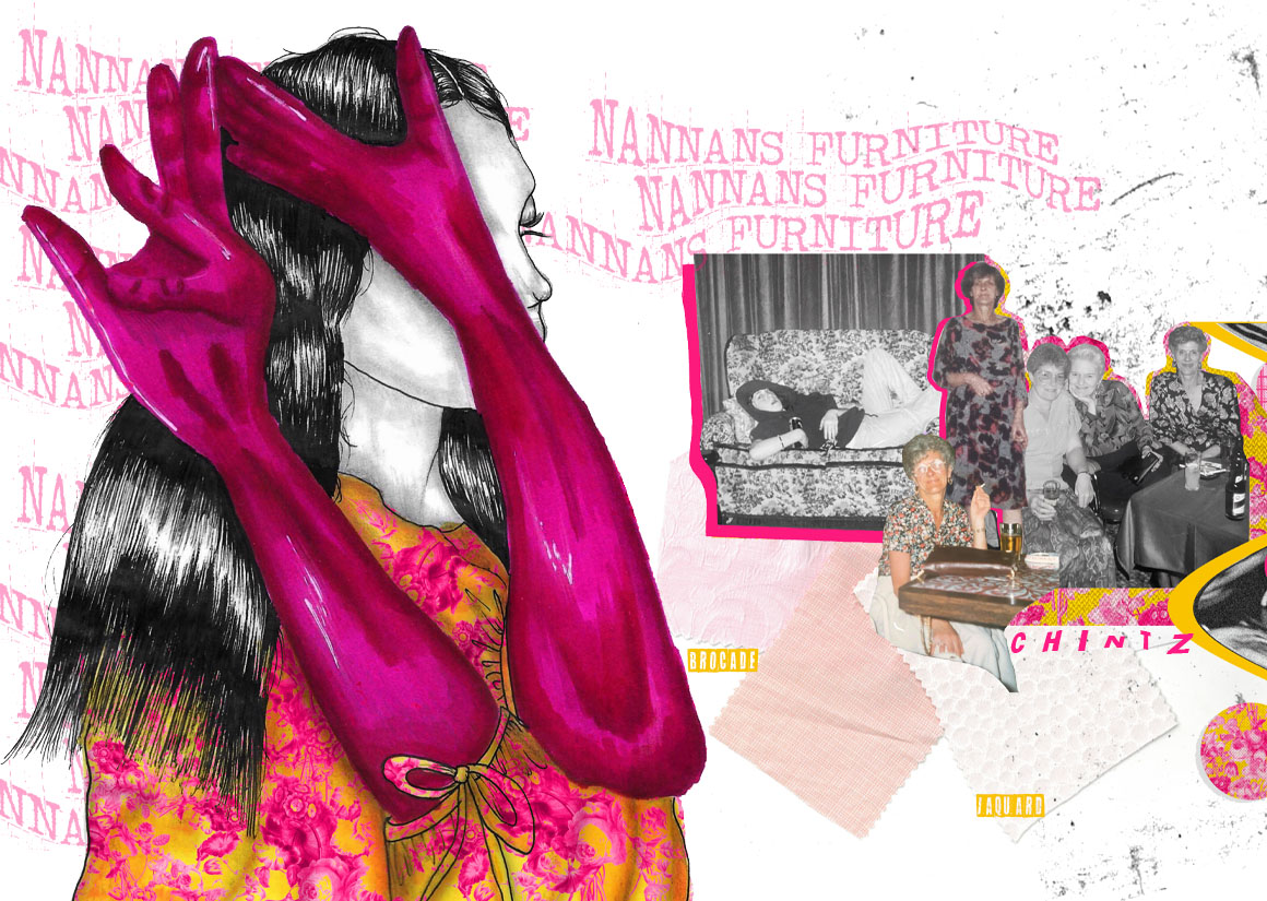
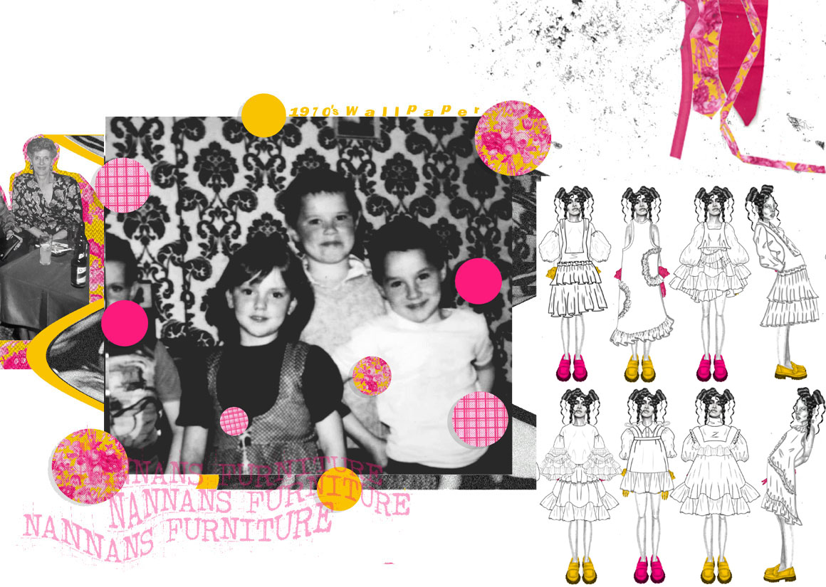
My projects concept came from my hobby of looking into my family history and noticing all I had left was official documents and hardly anything about their character. The feeling of finding out about my grandparents and seeing old photos that have been handed down to me was surreal and I felt a sense of longing to know more. I thought about how family photos offer a glimpse into members' worlds and that we find ourselves romanticising the past; never quite seeing the bad and the ugly just the good times.
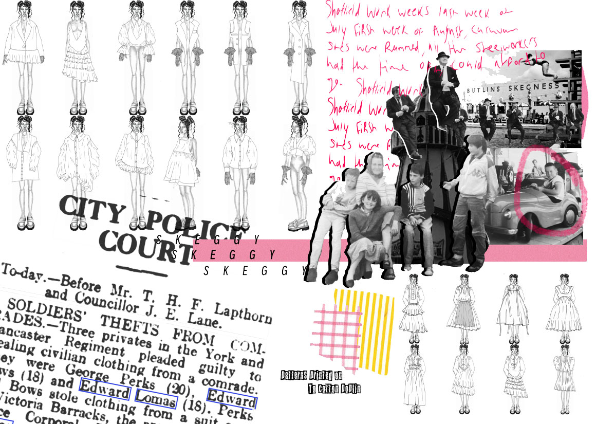
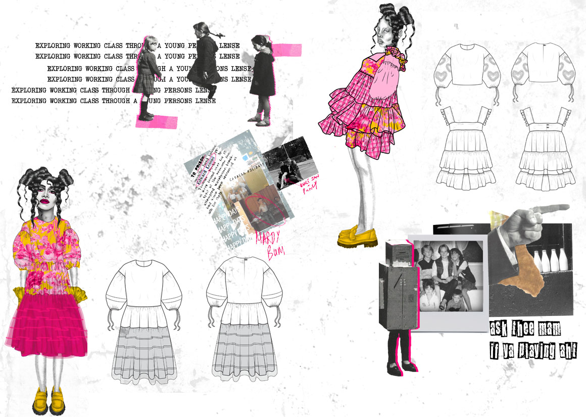
To play with this concept of rose tinted glasses I turned to my working class routes by looking into my parents upbringing, experiencing class through an adolescent perspective.
MY WORK
PORTFOLIOS
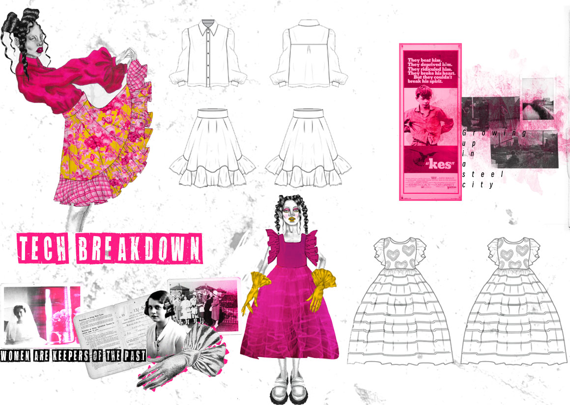
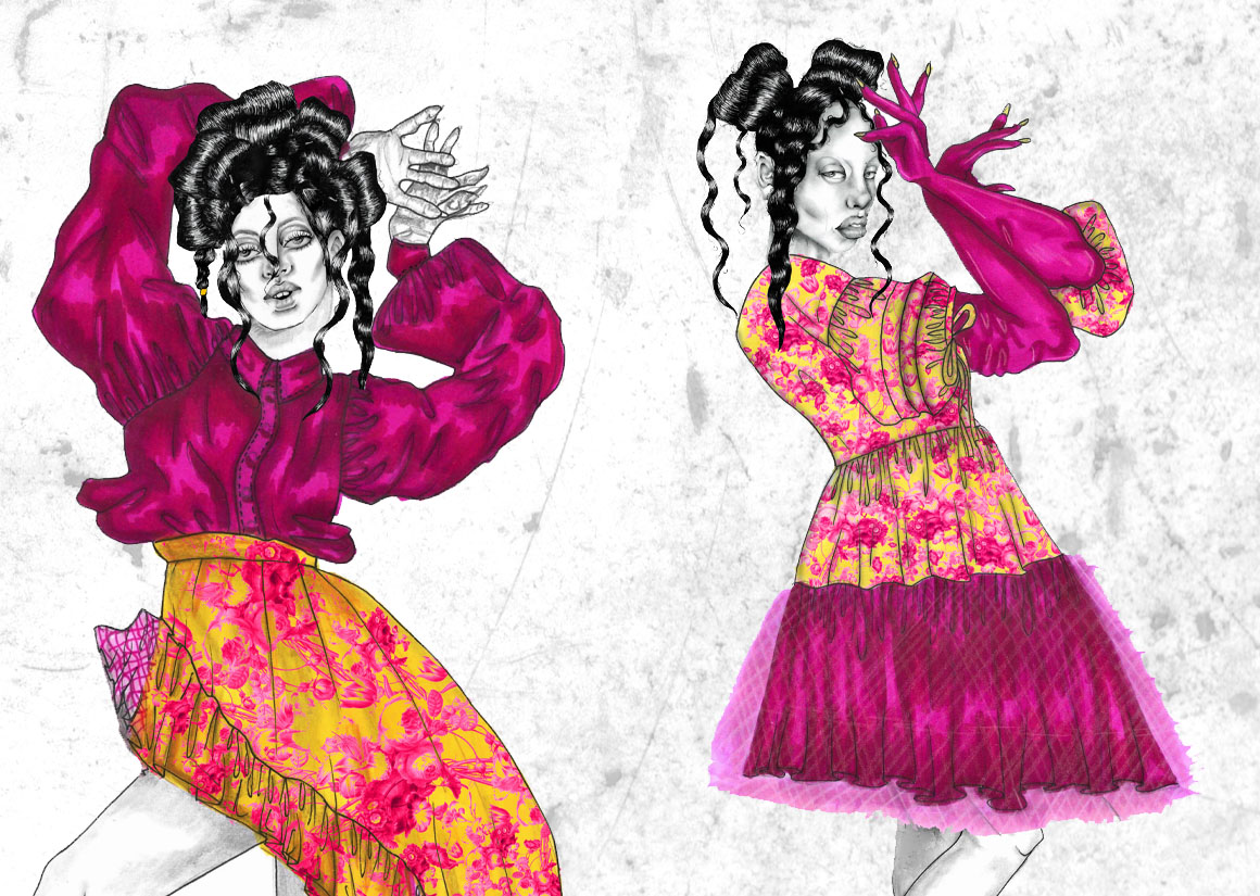
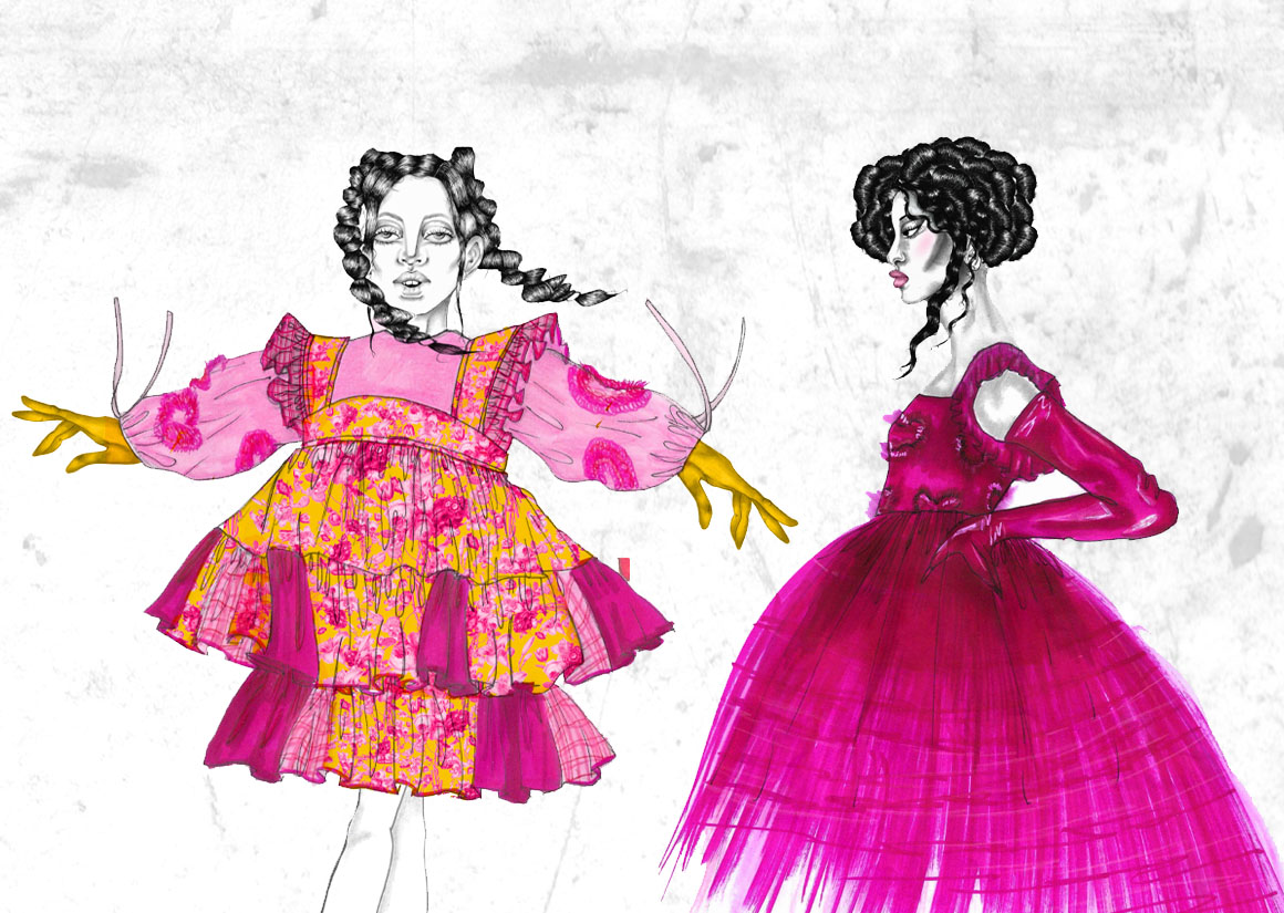
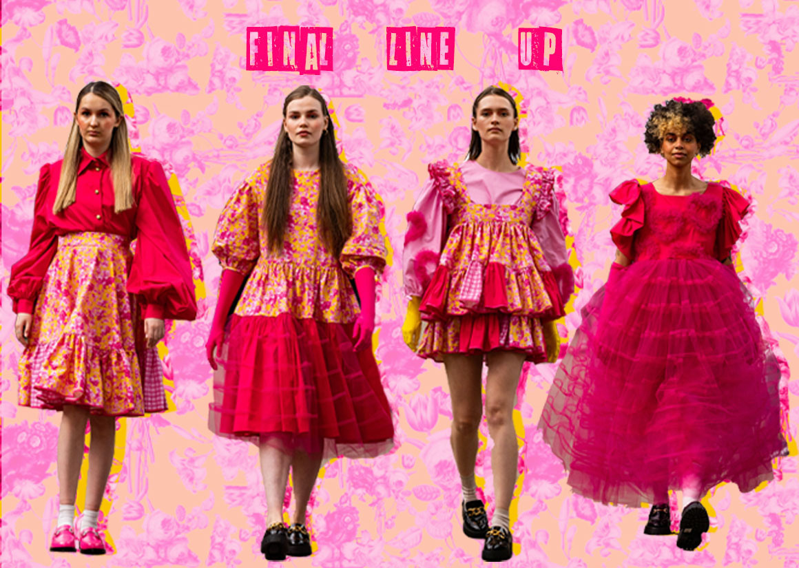
DETAIL
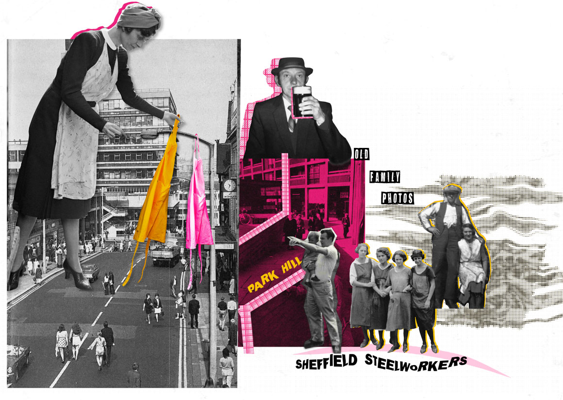
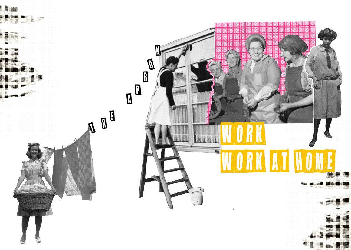
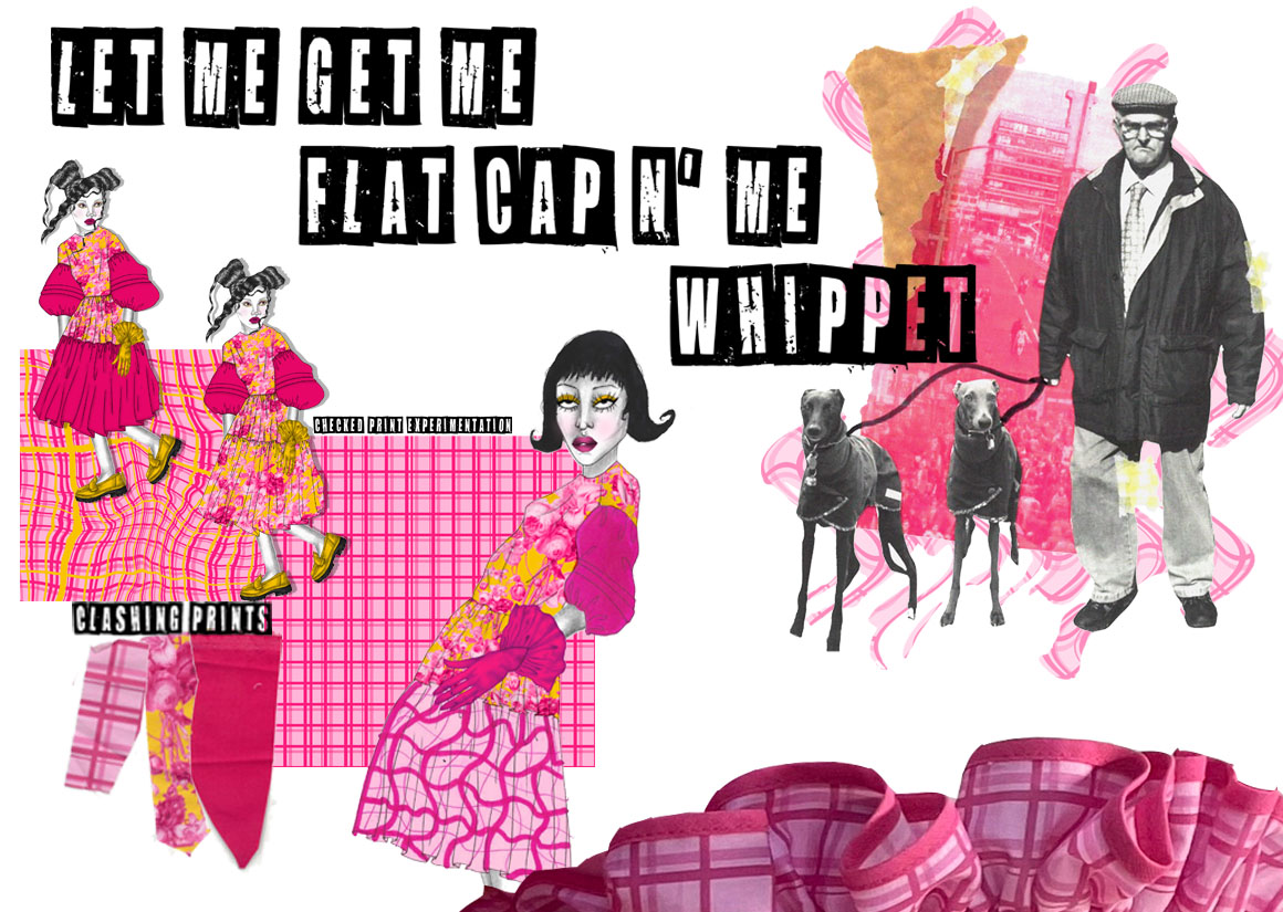
My collection was a trip down memory lane… from flat caps down to the Carpet and curtains.
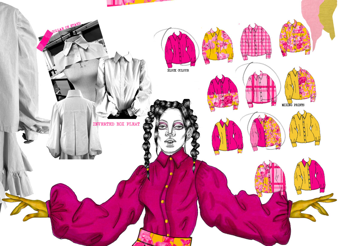
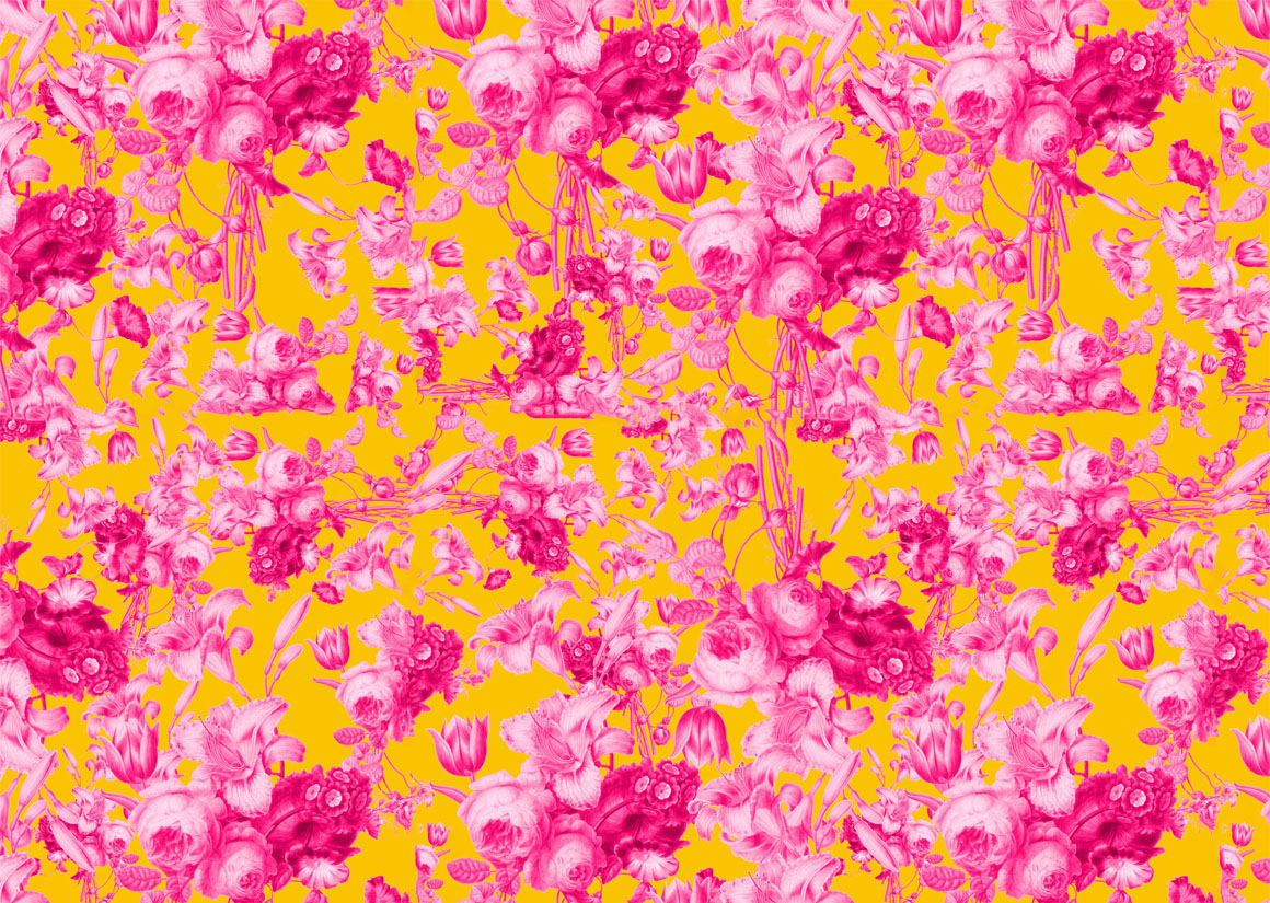
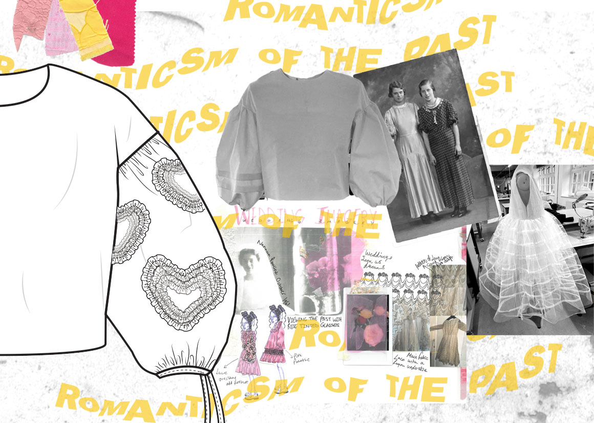
Earlier within my research I looked at veils and light fabrics shown in my family photos. I did French seams within the tulle to give a blur and distortion which often happens with memories of loved ones. I wanted to capture the childlike elements that I had researched Tulle hearts added texture and the sense of playfulness I desired. Within my work I was able to identify Nannans furniture as a theme I explored this further by looking at old wedding invites, chintz and lace used within ancestors wedding photos. I used old paintings and created repetitive patterns, replacing the muted tones with vibrant pink and dashing yellow. I looked into the stereotype of Yorkshire men with their ‘flat caps and whippets’. I related this back to my own grandads, who both adorned tweed check flat caps. I chose to produce my own check print using my colour schemes to offer a contrast to the floral. I printed onto cotton twill to evoke the look of upholstery. My pieces were a translation of my Romantic take on my heritage
How do you know yourself if you do not know your peoples history? You are their artwork. You are an heirloom your ancestors handed down -Jaiya John


Graduate Fashion Week in partnership with:


